My Role
Co-Founder, end-to-end product design,
user research
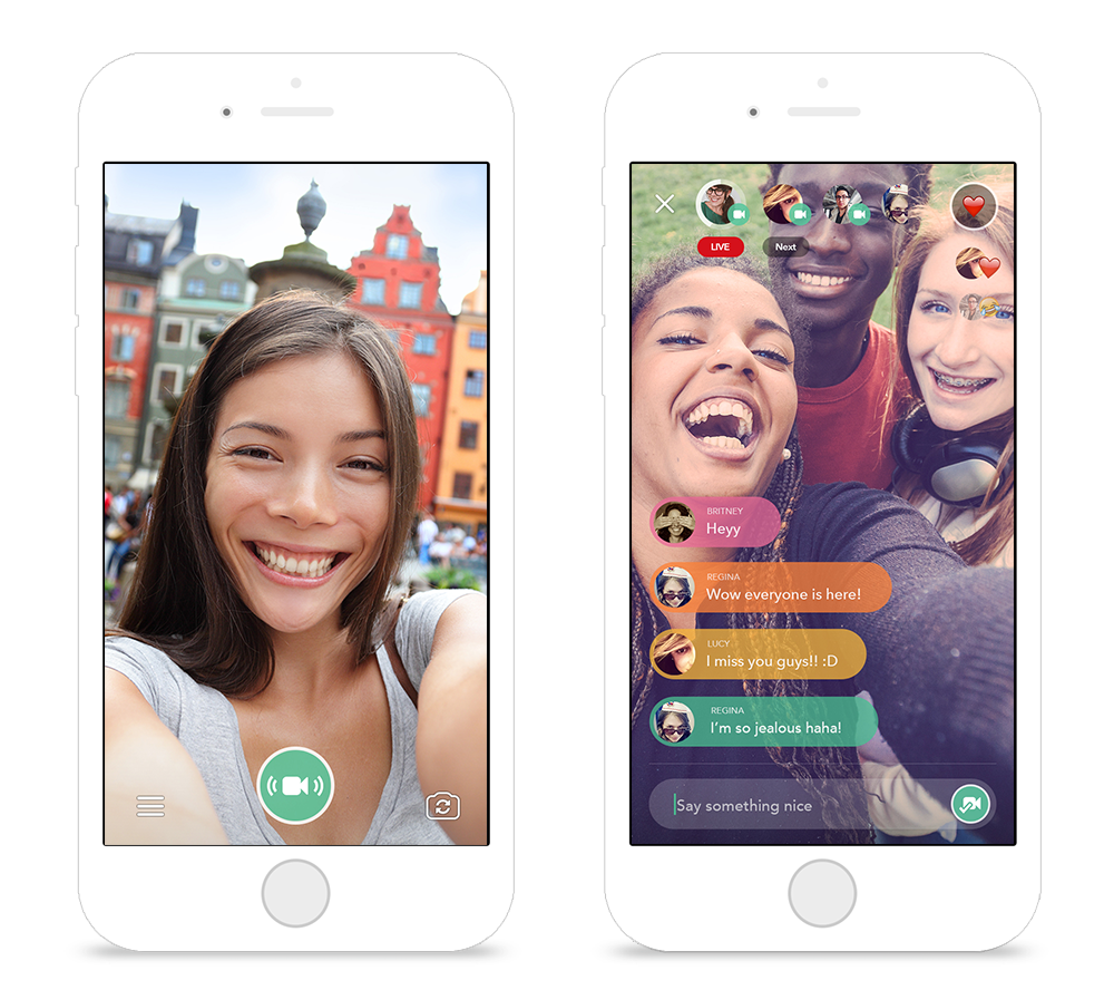
Chubble started as an experimental project at Feelit, Inc. The company’s focus at the time was to build an emotional layer over content, and connect people around feelings. With the rise of live-streaming services in 2015, we wanted to see what it would be like to have a live-steaming app powered by feelings.
Real Time Emotions
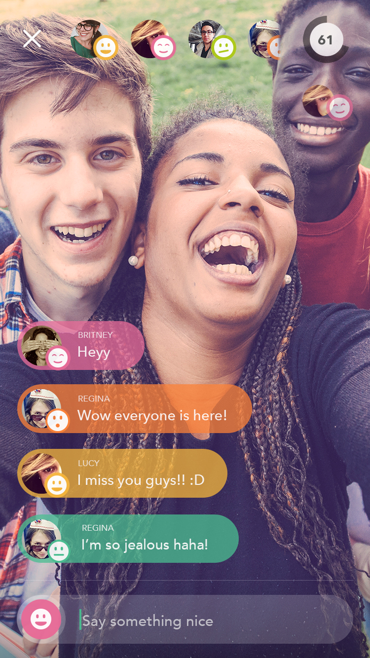
Chubble’s first concept was a live streaming app that recognizes emotions and facial expressions in real time to show the current feelings of everyone watching the stream. By using facial recognition technology, we capture the viewers’ emotions directly from the front-camera.
Camera-Centered Design
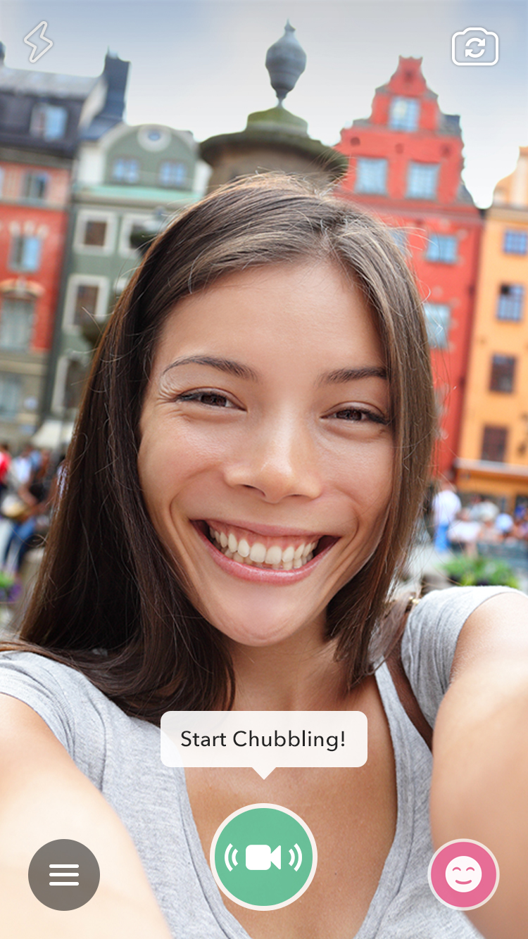
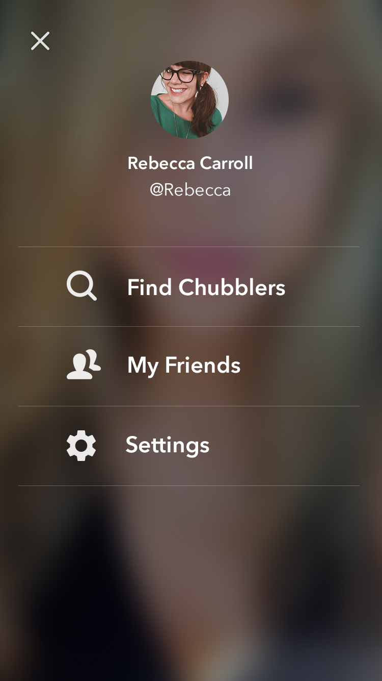
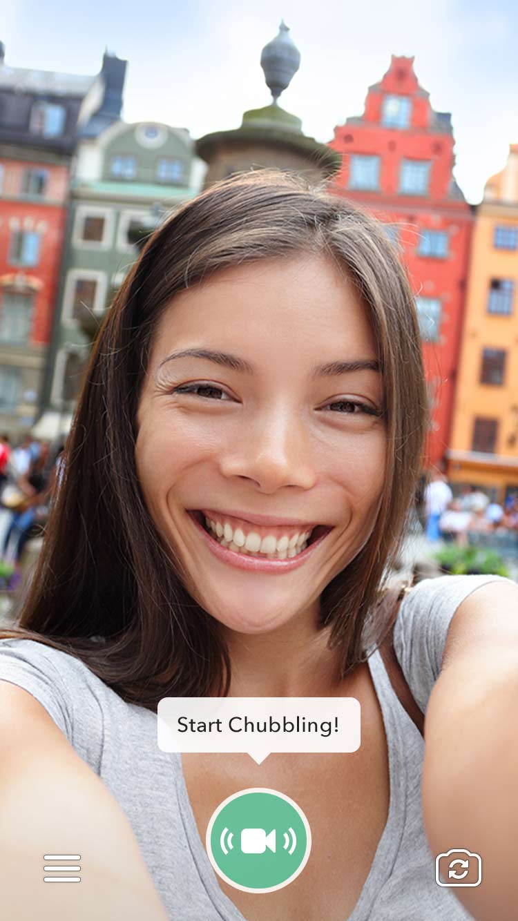
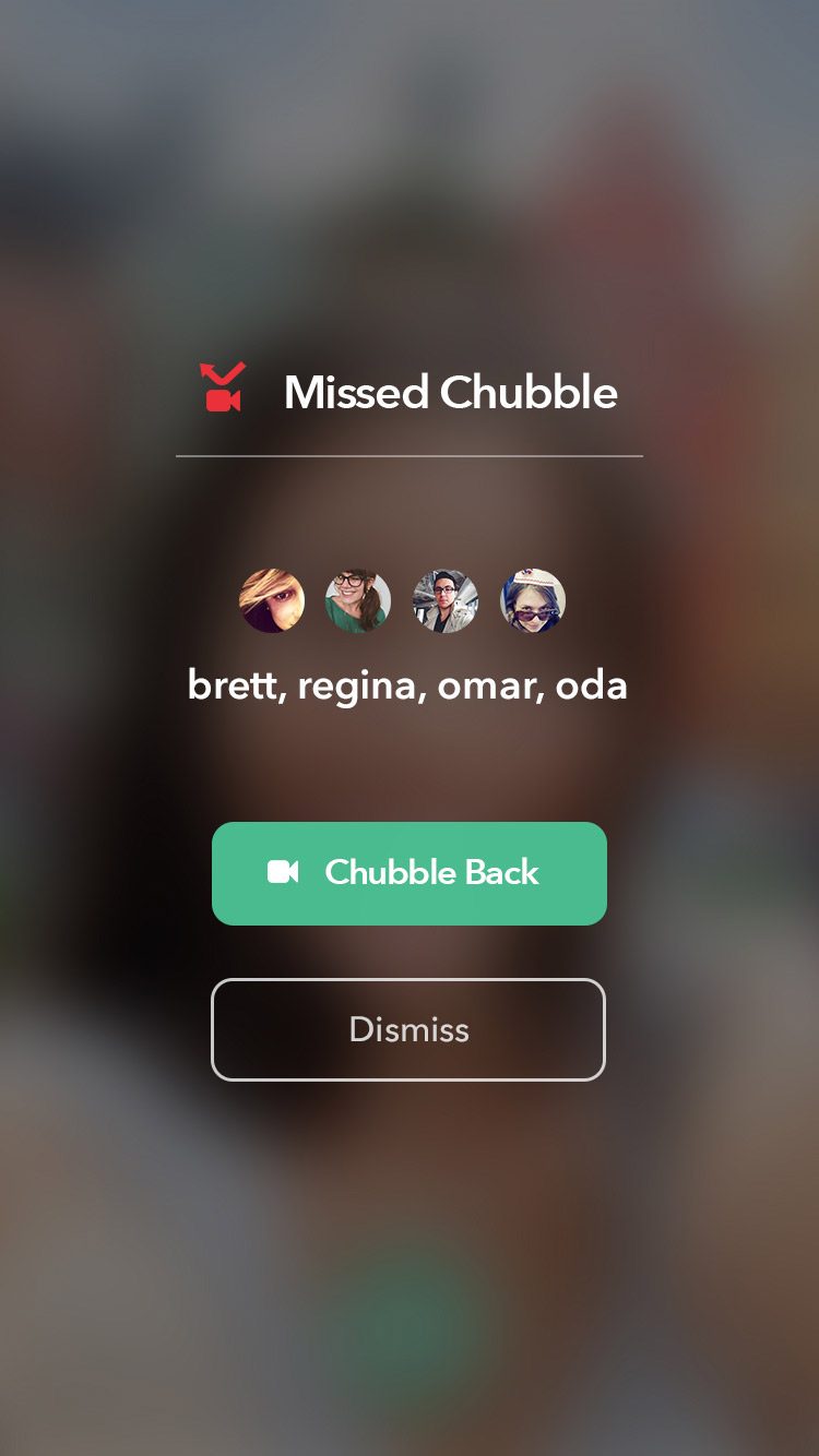
The main (home) screen needed to be inviting for users to start live-streaming, so the whole design is centered around the camera view, with a big prominent button in the middle to start Chubbling. Other screens, such as the menu, also included a blurred view of the camera in the background to reflect the nature of this app.
Finding the Path to Organic Growth
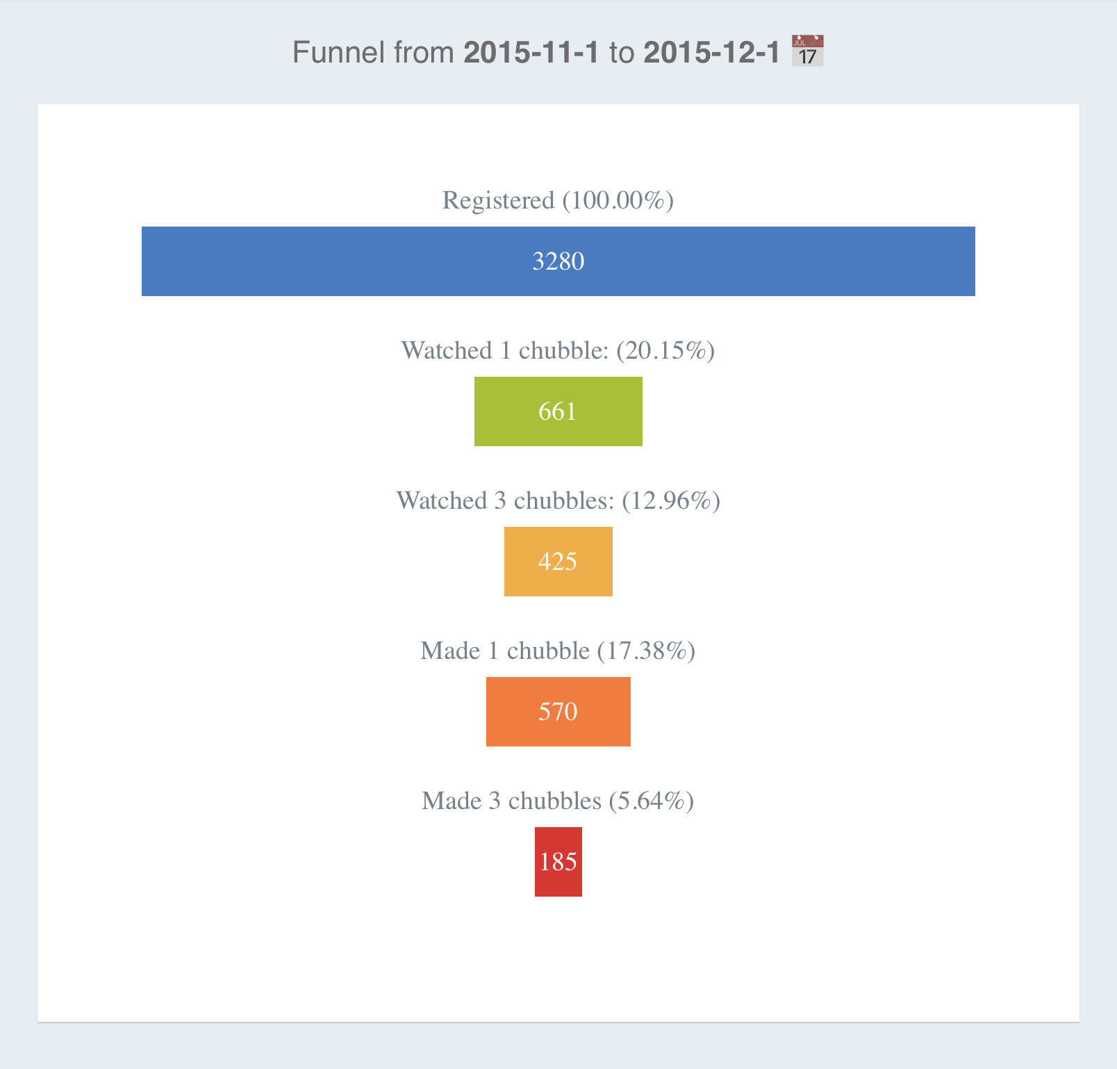
After its launch, Chubble gained some traction, but wasn’t growing fast enough. Furthermore, our user acquisition funnel was leaking; there was a big gap between our acquisition and activation numbers.
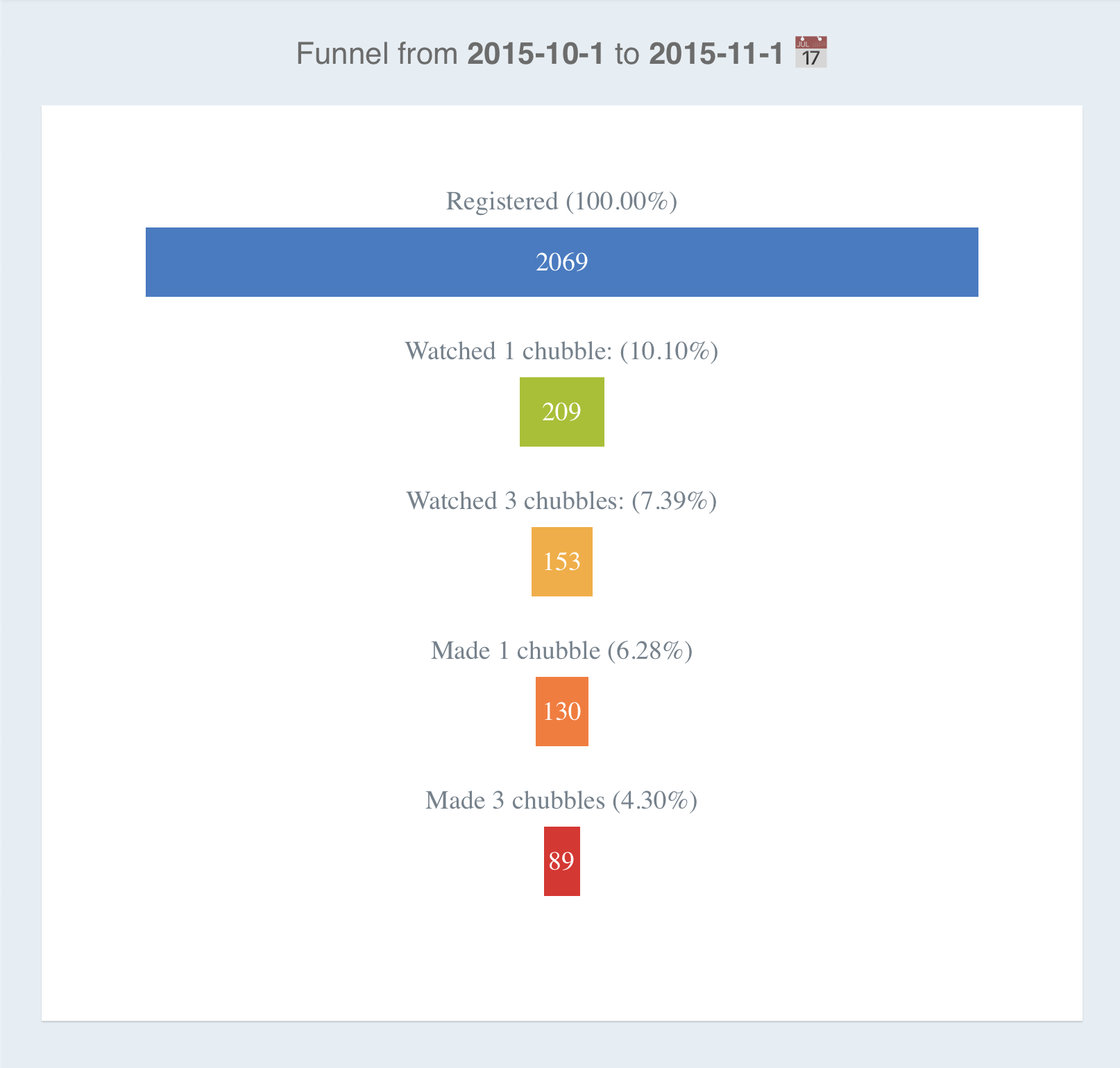
Upon research and investigation, we hypothesized that this could be due to the complexity of the app idea for first timers & the fear of the unknown. After all, it’s not that common to have apps automatically capture your emotions and display them to others, let alone combine that with live-streaming. Here’s what we tried to do to solve that, and what we learned in each phase:
Experiment 1: Onboarding GIF
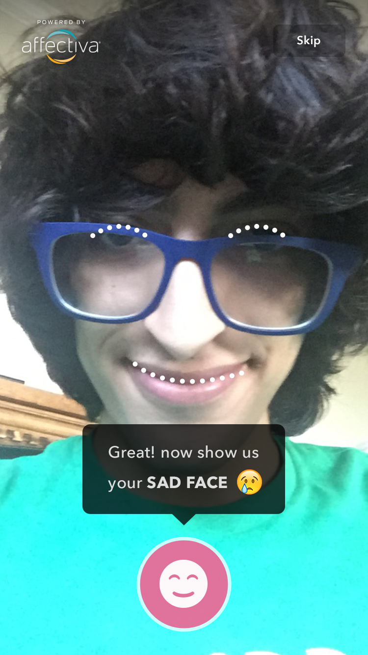
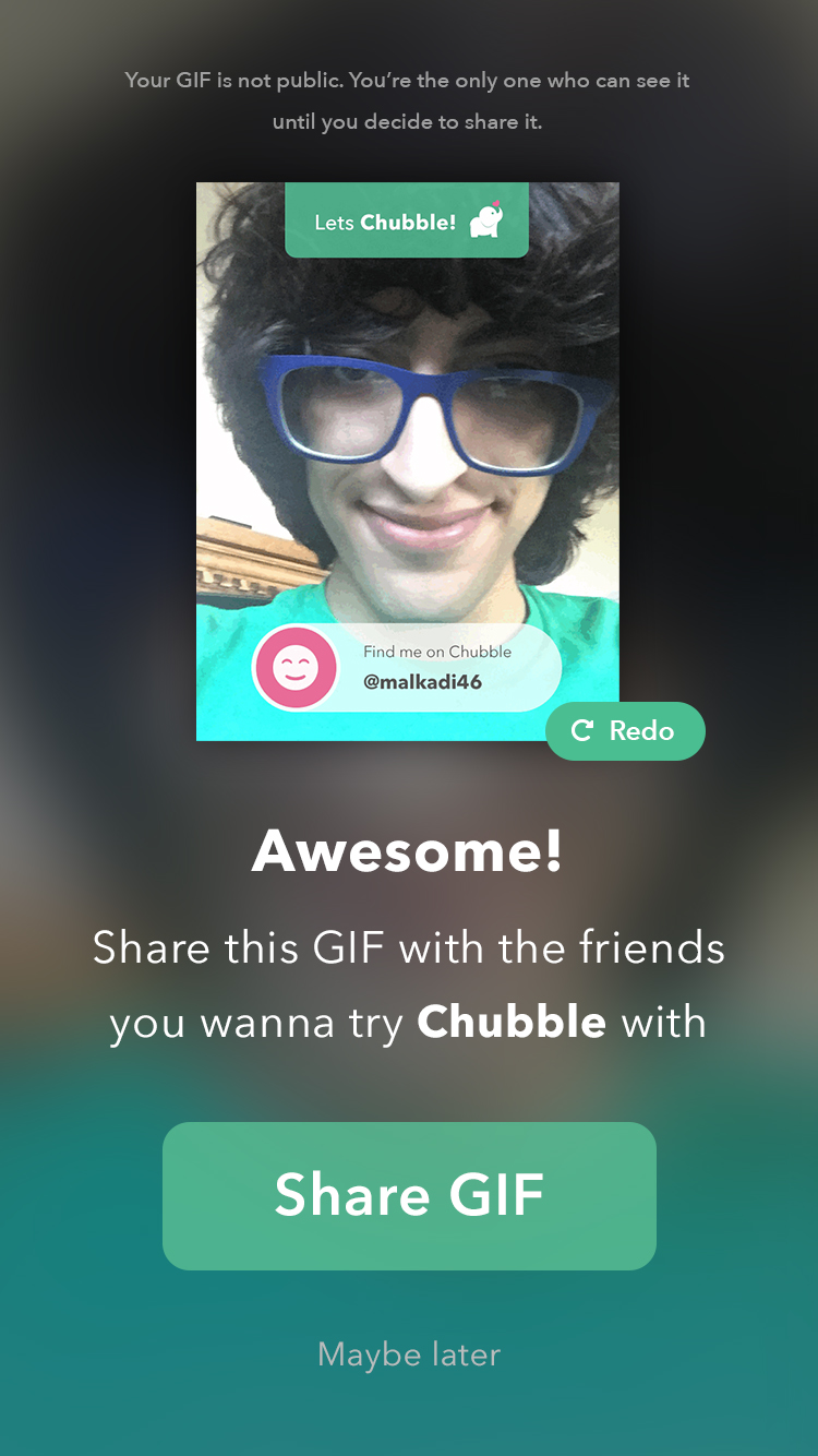
The very first thing we tried was explaining the concept in an interactive experience in onboarding. Users walked through the facial recognition technology, and followed a tutorial that captured their faces with 3 different emotions, and combined them in 1 GIF that they could share with their friends they want to try Chubble with.
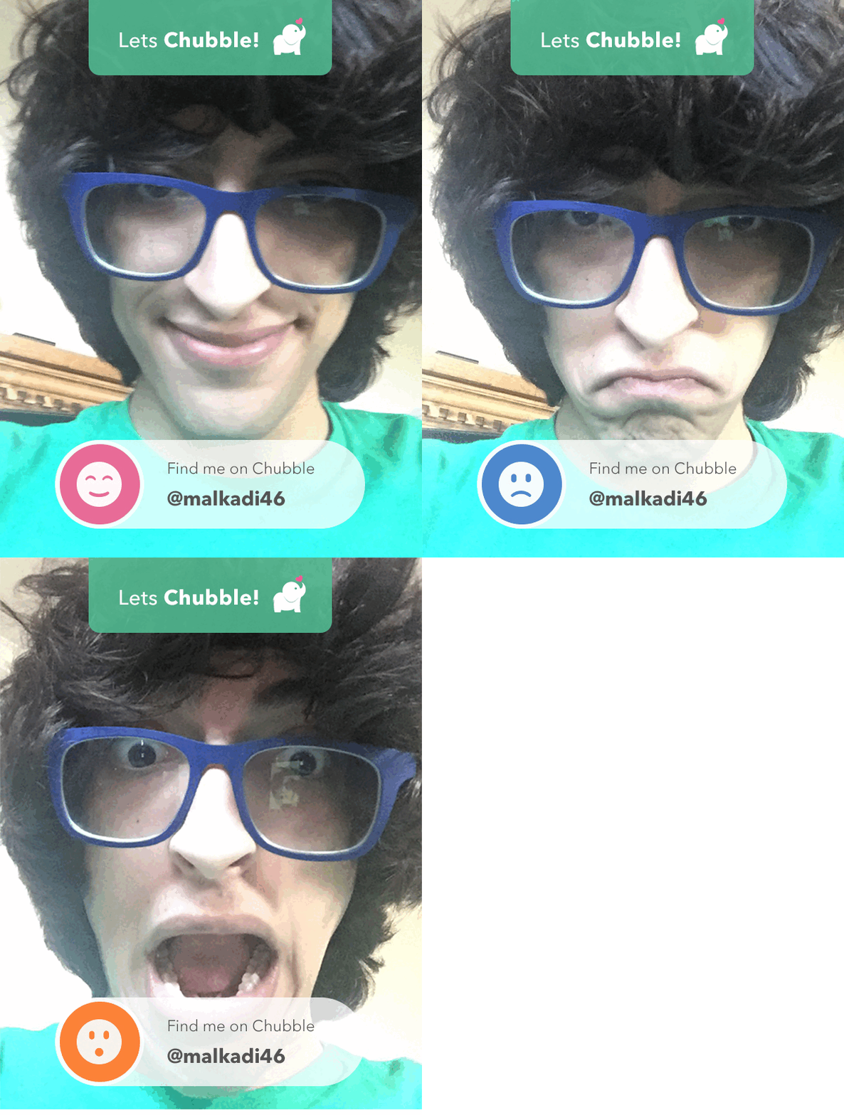
Results
This idea didn’t really take off. Very few users shared their GIF, and many continued to be confused about Chubble and how to use it. Here’s what we learned:
- While the idea sounded fun at first, it proved to be very difficult to implement smoothly. For example, the user needed to be facing the camera directly with enough light on their face. There were other bugs that made the whole experience feel distracting and confusing.
- Some felt that this was invasive. They didn’t expect that their photo would be taken and they were not ready for that.
Experiment 2: Showing a Video of How Chubble Works
The second solution we tried was explaining the concept through videos. We created this video of a girl on her phone going through different emotions, and showing how that is reflected on her avatar.
We also created a sample Chubble livestream showing the app in action. Here’s how all of that looked in onboarding:
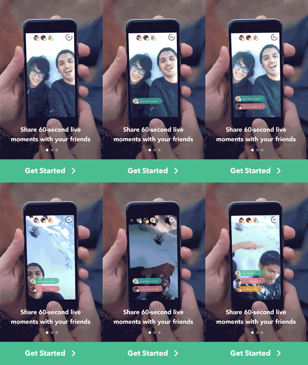
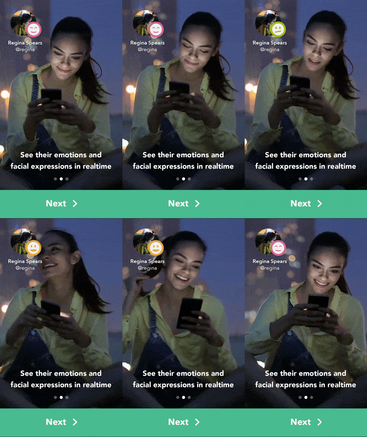
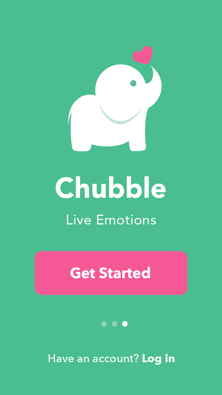
I remember I was particularly proud of this output 😃 It felt simple and elegant, and I was excited to test it with users. So, we went ahead and launched it.
Results
After launching this experiment, our funnel started to improve a little, but we still had a big leak of users we lost after regsiteration.
 →
→ 
It wasn’t exactly clear why that is, and more generally, it wasn’t clear to us how people experience our product for the first time. We decided to conduct some usability interviews; my product manager & I bought a bunch of Starbucks gift cards and headed to Stonestown mall in San Francisco to meet some people.
Usability Testing
At Stonestown mall in San Francisco, we interviewed 10 people for a usability test. Something I personally like about such interviews is that people are on the go, and are more likely to resemble what real users do as opposed to someone setting in a usability lab, paying full attention and intentionally exploring every corner of the app.

Goals
- Test the new onboarding concept & messaging; do users get it?
- Test overall impression of the app; do users like it?
- Test the whole user experience; is it easy to use? Is it pleasant?
Task
Testers were given an iPhone and told to go to the app store, download Chubble, create an account and go through the onboarding process. We considered the app store listing (app name, description, screenshots... etc.) to be part of the actual user journey so we included it in the test.
Results
- 9 out of 10 testers rushed through onboarding as quickly as they could. On every screen, their eyes and fingers were always after the button that moves them to the next step. They did not stop to read the text or watch the videos.
- As I watched them do that, I kept a straight face in order to avoid any influence, but I was definitely crying on the inside 😭
- All testers finished the task without major usability concerns; they were able to find the right buttons and advance without confusion / frustration.
- After finishing the task, 8 out of 10 felt confused on what the app is for exactly.
- After explaining the concept to them, 7 out of 10 mentioned that they loved the app idea and would use it, and 3 seemed indifferent about it.
In conclusion, the usability test was insightful & enlightening. It gave us a better way to get into the mindset of our users.
Experiment 3: Letting Users Join a Sample Livestream
All the above solutions explained Chubble to users conceptually in onboarding. Since they didn’t really work, we asked ourselves: what if we could integrate the education process in the actual product experience? We created a sample (fake) livestream that users could join as soon as they finish onboarding. This gives them the ability to have a first-hand experience of the product in action.
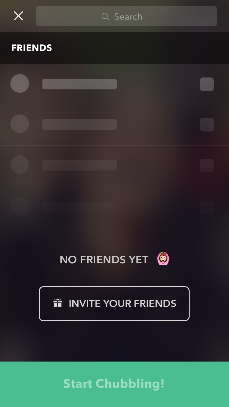
In addition to that, we worked on solving another problem. Our data indicated that users didn’t have enough friends to Chubble with after they finish onboarding. Part of onboarding included a step where users could connect their address book to find friends & add them. We made that button more prominent and changed the experience from (Connect address book then manually add friends) to (Connect address book & automatically add friends with 1 click).
Results
The results of this experiment were astonishing. Chubble quickly started picking up momentum & all the numbers started growing: the number of Chubbles created, number of minutes streamed, and number of new users joining. The gap in our aquisiton funnel beautifully shrunk.


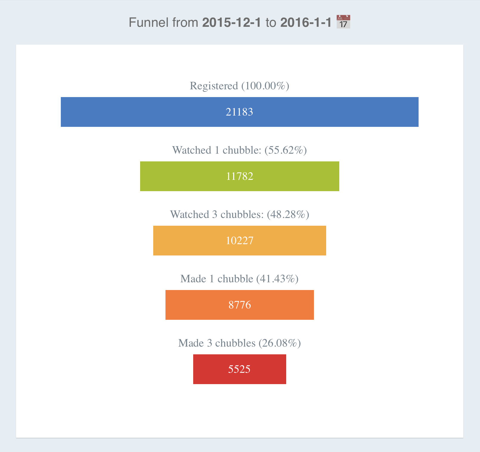
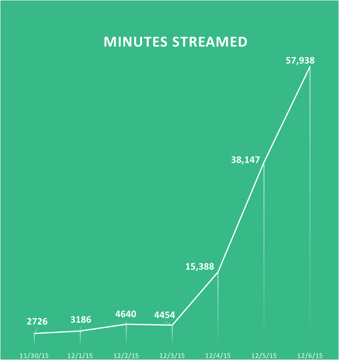
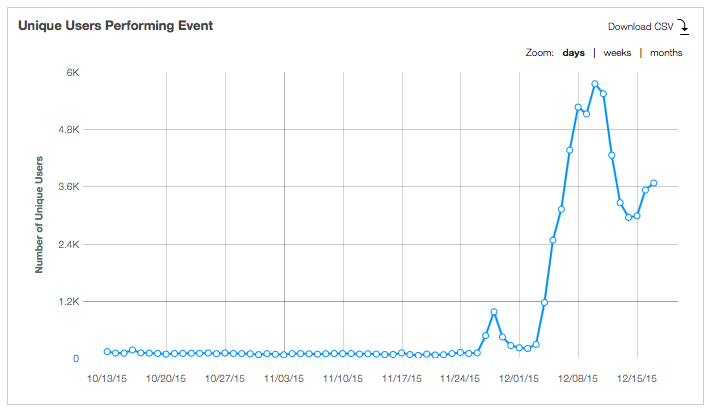
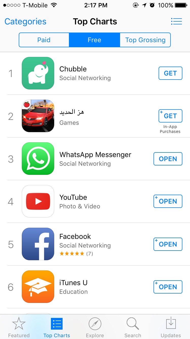
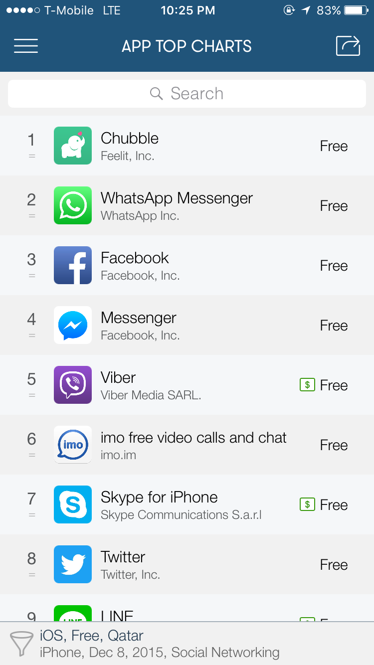
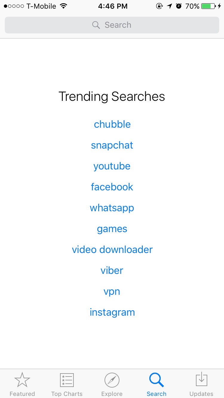
Chubble reached the top charts in more than one app store around the world, and was the number 1 trending in search. As we watched all of this happen, we were overwhelmed with joy and excitement. I remember how I turned to my co-founders and said: so it seems like organic growth is a real a thing, it’s not a myth!
Privacy Focused
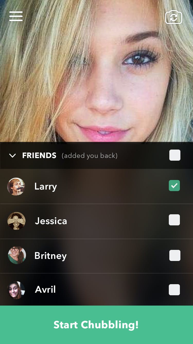
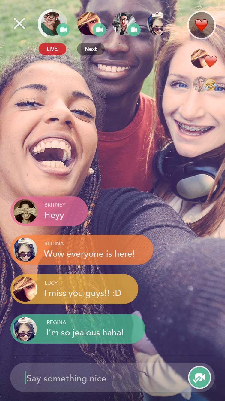
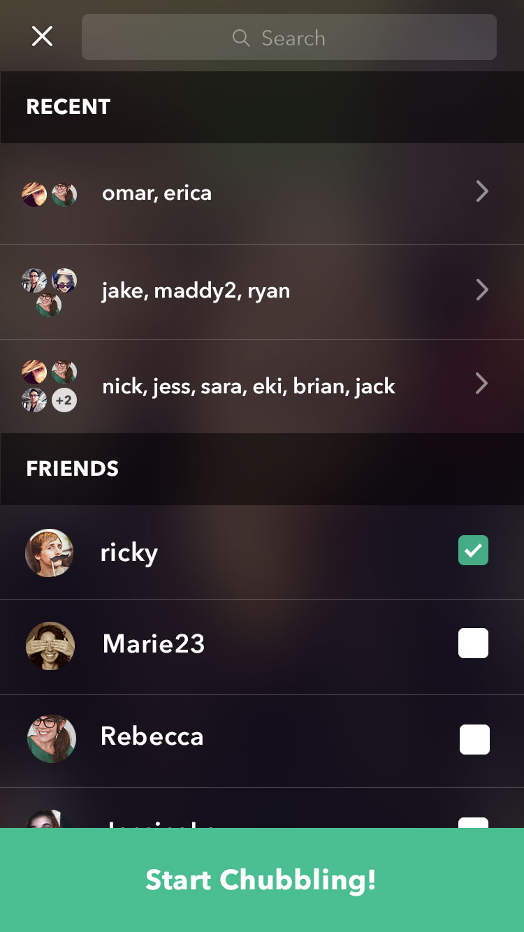
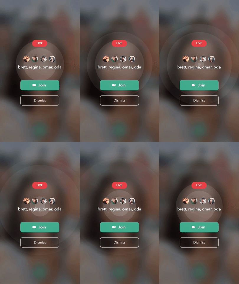
As the app grew, we spent more time researching & studying our user behavior. It became clear that the number 1 thing people liked about the service is the privacy: the fact that they can select who they will Chubble with before starting the Chubble. In a world where most live-streaming services were tailerd to influencers and being public-first, users loved how Chubble felt like it was made for them and their friends. It also became clear that users didn’t really care about the ‘emotion-detection’ piece. They didn’t pay attention to what people were “feeling” as they were watching the streams. So we decided to remove the emotion-detection piece, and focus more on the privacy aspect.
📰 Featured
Chubble managed to gain some spotlight. In its first week, it was featured in product hunt, and earned the #5 product of the day badge, and was the 3rd in terms of number of upvotes.
The app was also picked up by other news & media outlets like this one.

