My Role
Co-Founder, End-to-end product design,
some front-end development
Intro
Feelit’s mission was to connect everyone around emotions. The social network allowed people to express their feelings in a safe & intimate way. Since its inception in 2013 until the company closed in 2016, the app attracted more than 200,000 users with around 50,000 MAU, and went through several major iterations that taught us so much about what it takes to build an engaging consumer experience. During my time at Feelit, I was responsible for product design where I solely designed the end-to-end user experience. I also worked on some web (front-end) development.
The Start
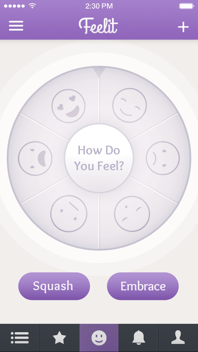
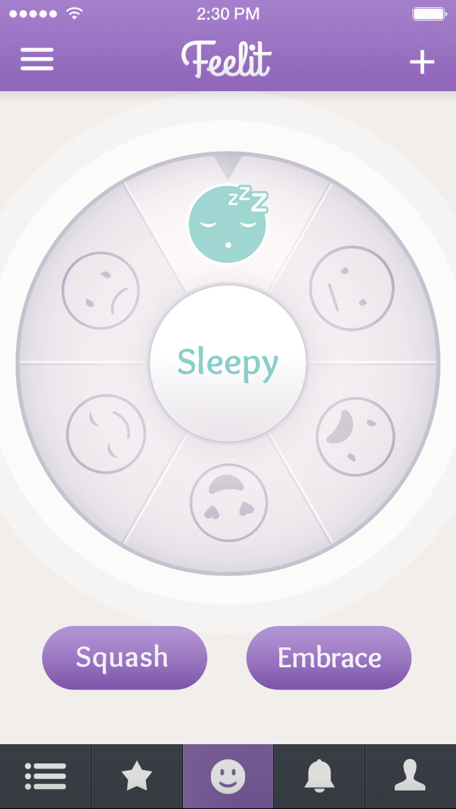
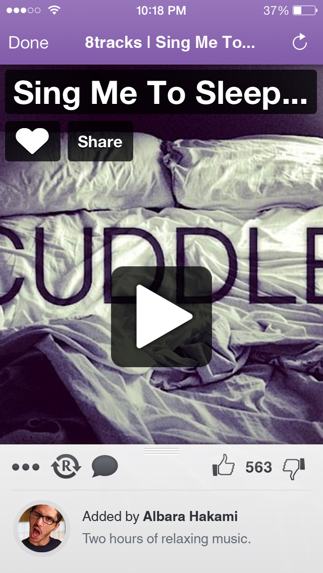
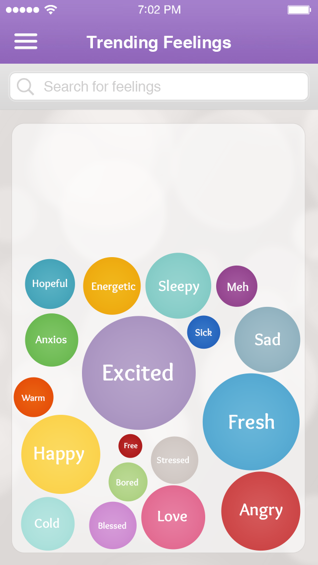
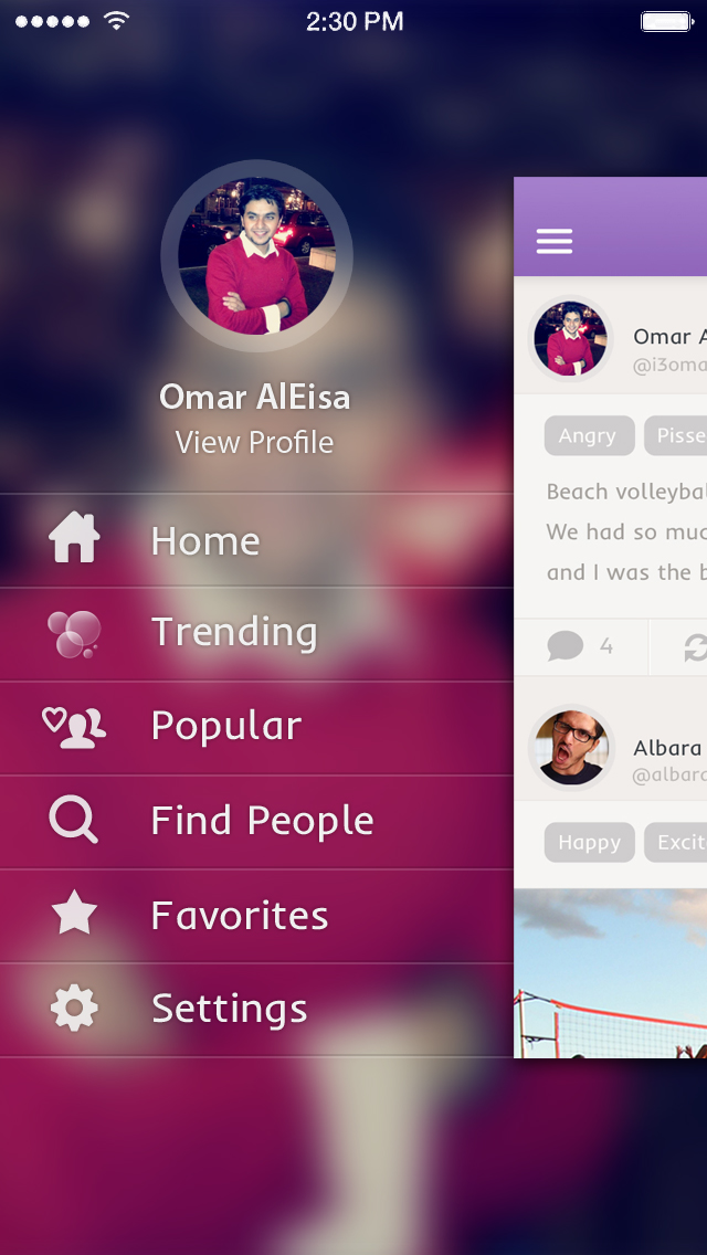
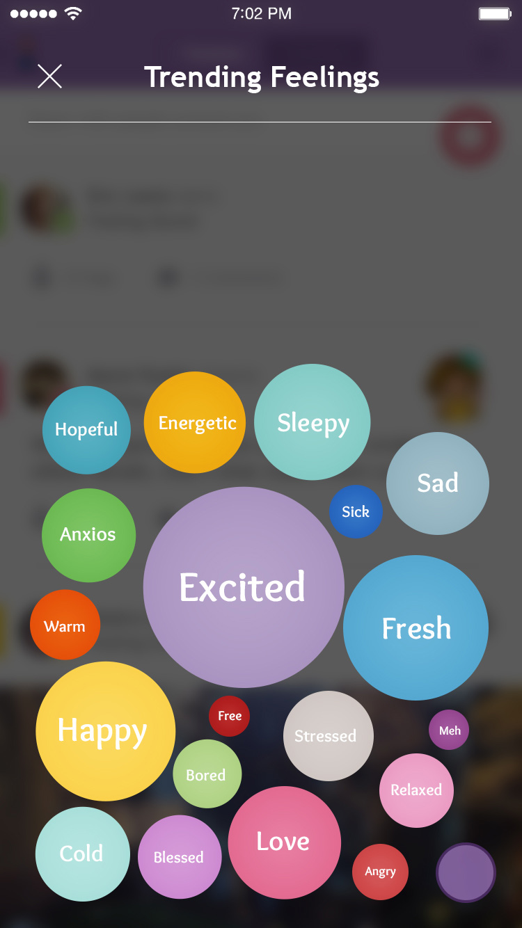
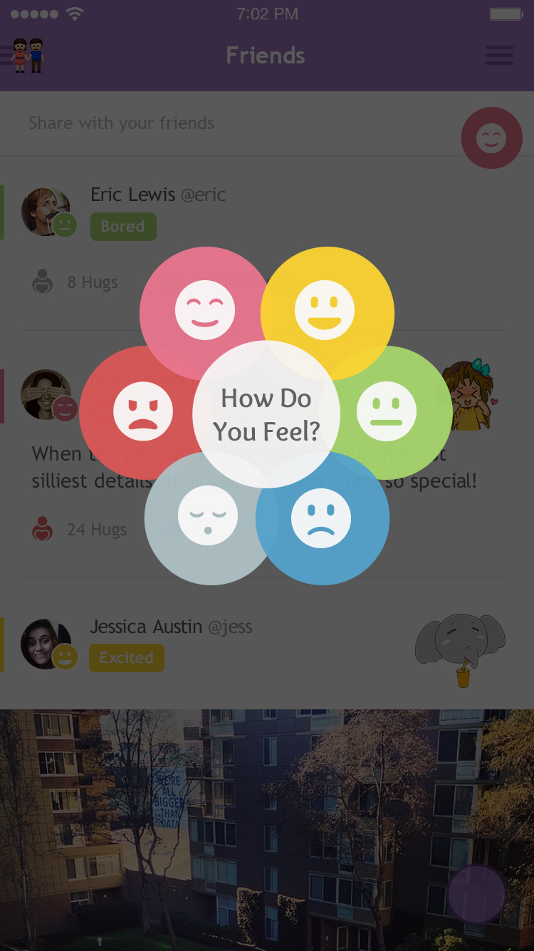
Feelit’s first version was meant to help people deal with their feelings. When users first opened the app, they saw a wheel that allowed them to chose how they feel and whether they want to 'Embrace' that feeling or 'Squash' it. Based on their choice, they would get videos, photos, and user-generated web content that helps them deal with their feelings the way they want. For example, if a user chose to 'Embrace' sleepiness, they might find relaxing music that will help them fall asleep. Right before launching the app, we decided to included a small feature where people could write how they feel in 3 words and share it with their followers. This little feature later became the cornerstone of Feelit.
☝️ Disclaimer
This was one of the very first UIs I've ever designed. Clearly, there's a lot that could be improved, but that super light gray is surely painful to my eyes now 😆. I'm only including it here to tell this product's story, and how it evolved over time. If I go back in time, I'd change that gray to a darker shade to achieve better contrast and improve visibility & accessibility.
Refresh Animation
Feelit v1 Walkthrough
The Hook
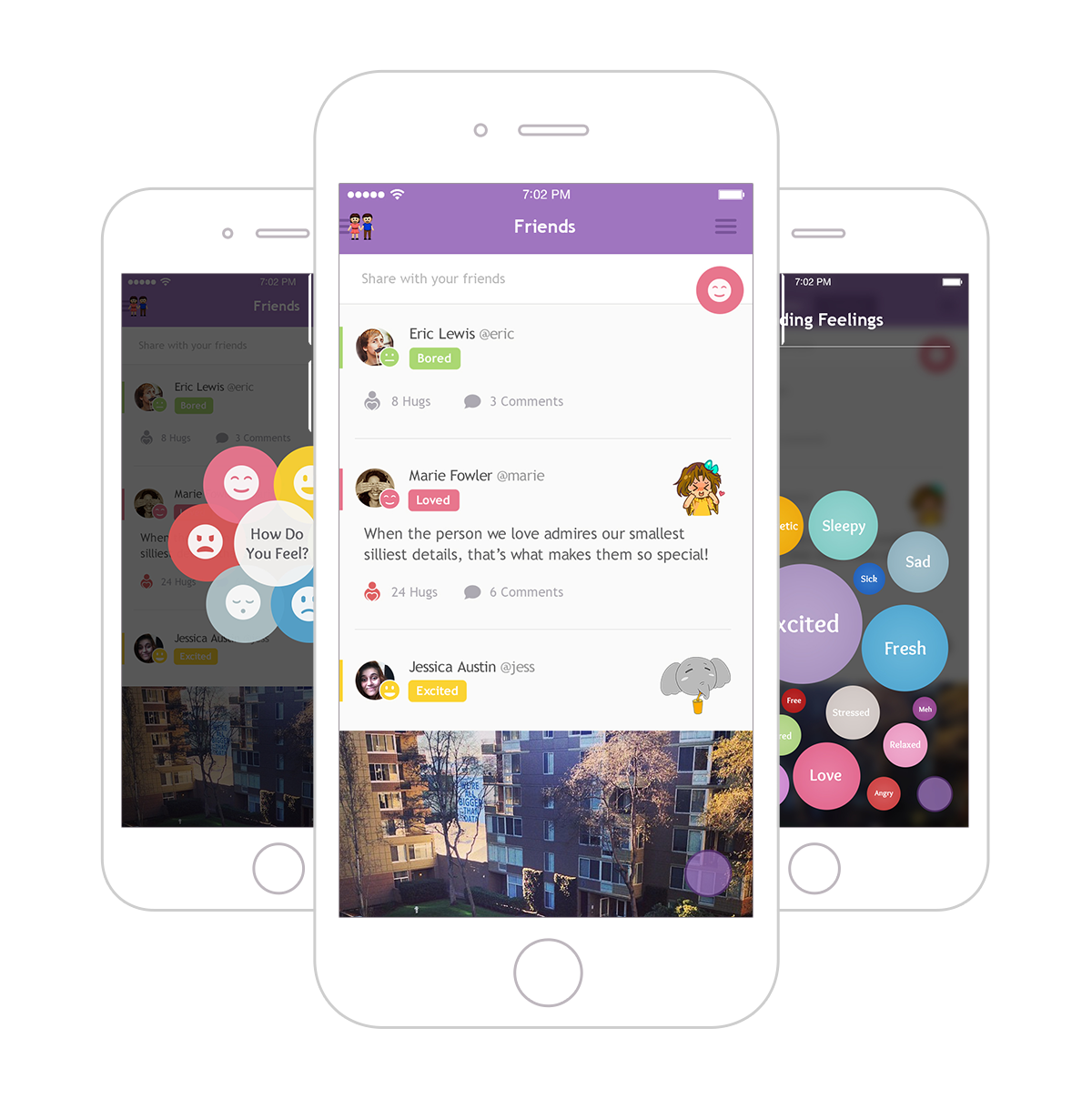
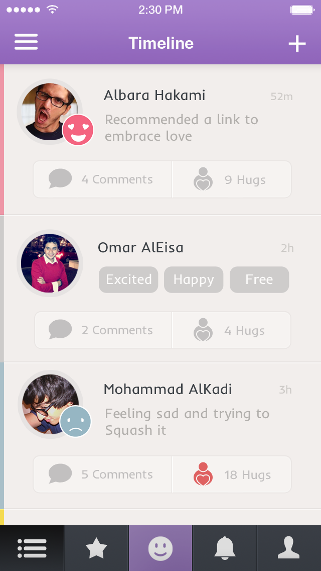
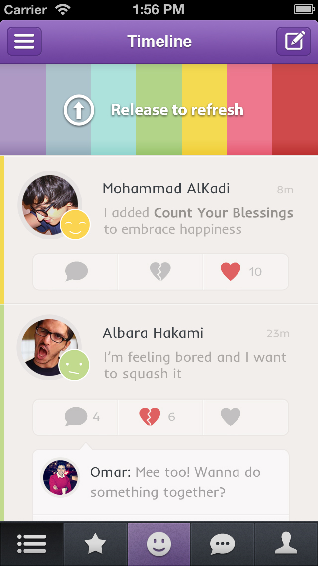
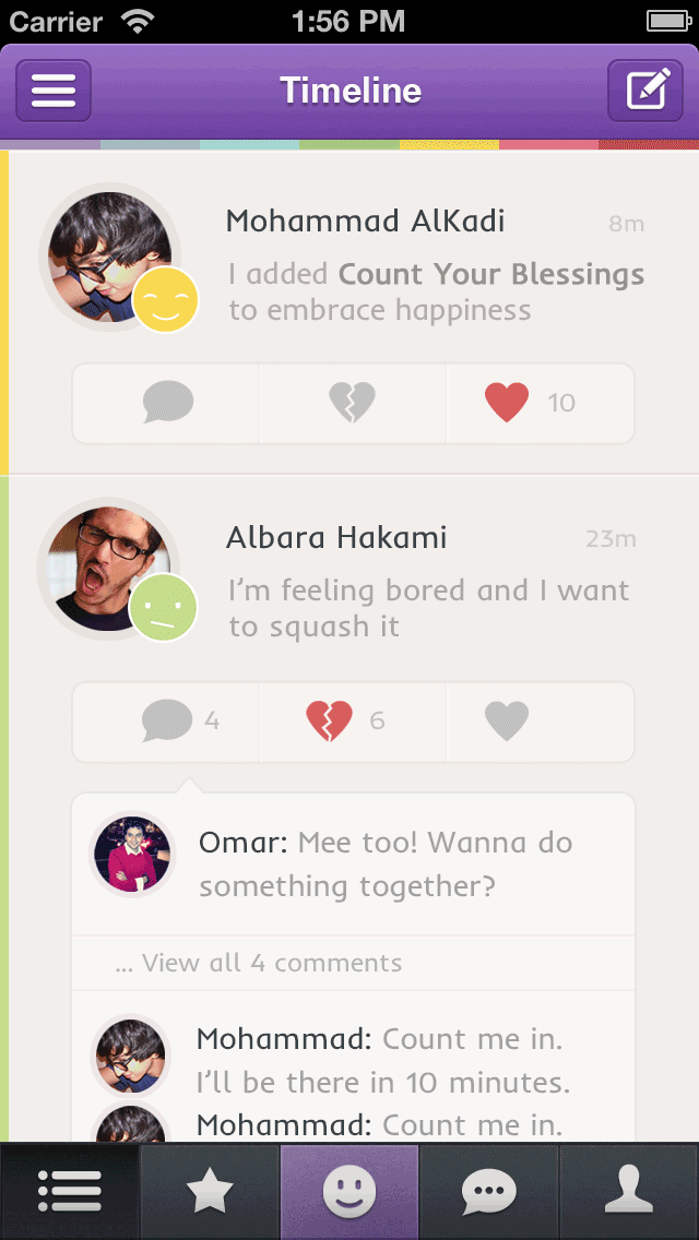
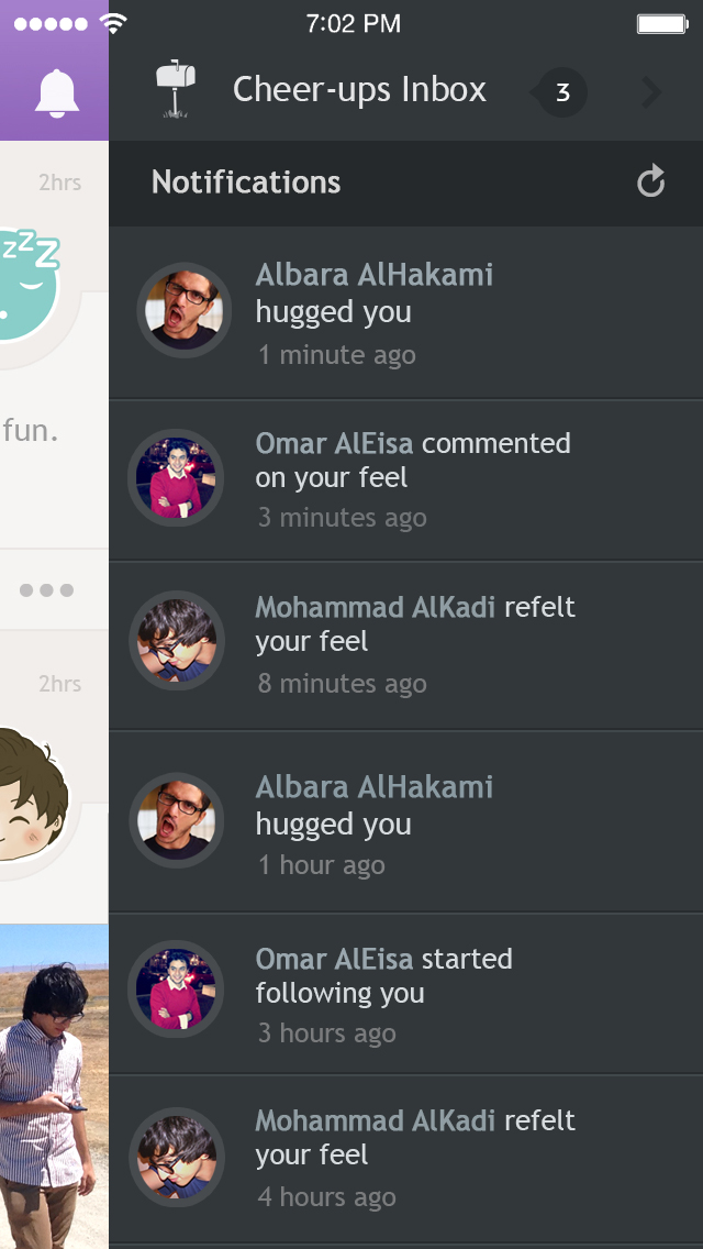
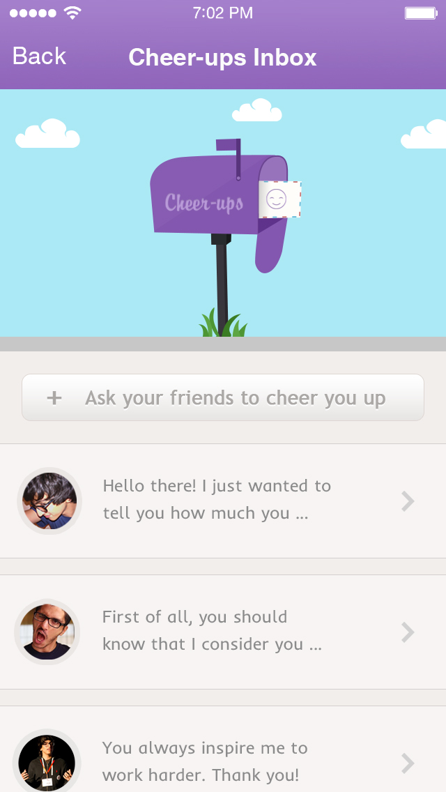
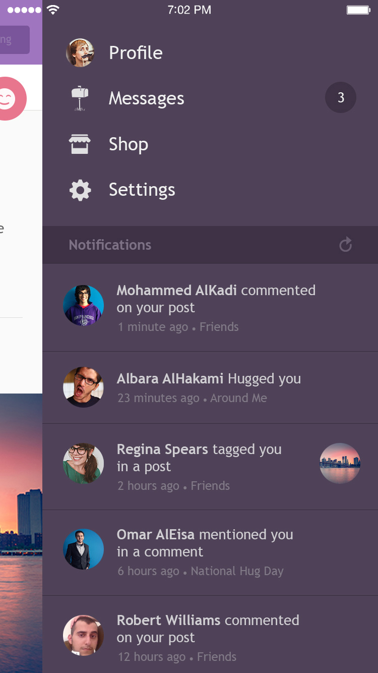
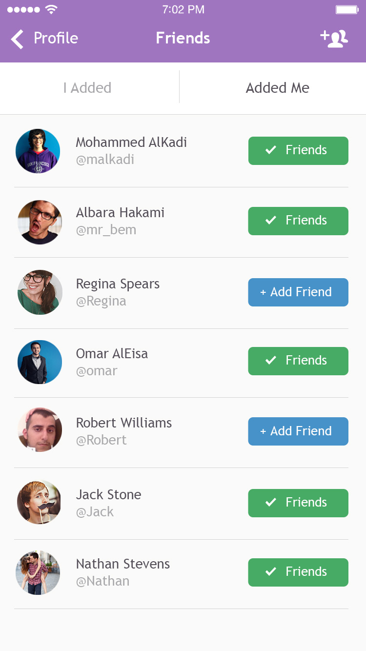
After its launch, the app started to pick up good traction. People loved the concept of the app, and the wheel of emotions. However, we noticed that wheel was mainly used by first timers. Recurring users often went straight to the “timeline” where they could write how they feel and interact with their friends by giving them “hugs” & leaving comments.
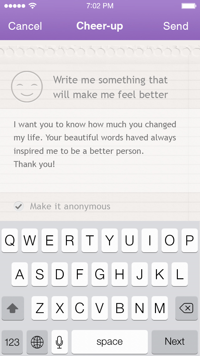
What was more interesting is that, even though the feature was very limited as it didn’t allow for a caption or anything in the post besides the 3 words, users found their ways around it. They would typically post their feelings, and share more and ‘vent’ in the first comment. In other words, they treated the first comment as a caption for their post. It became clear that this feature was the real ‘hook’ that brought users back to the app. Furthermore, when we looked at the data of the wheel (the main feature), the most common use case was selecting (Bored → Squash). That meant people mainly used it when they were bored to discover new content, and not to ‘deal’ with their feelings as it was designed.
The Pivot
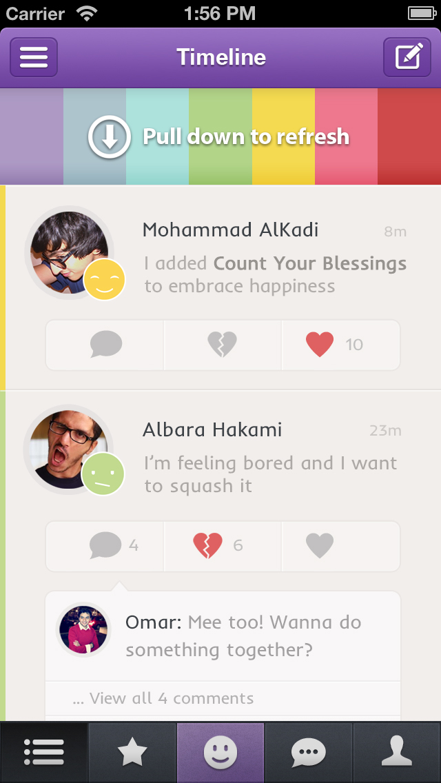
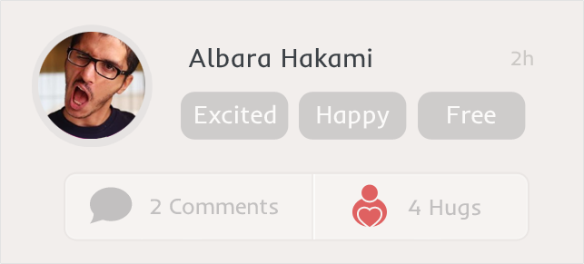
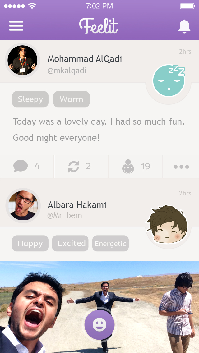
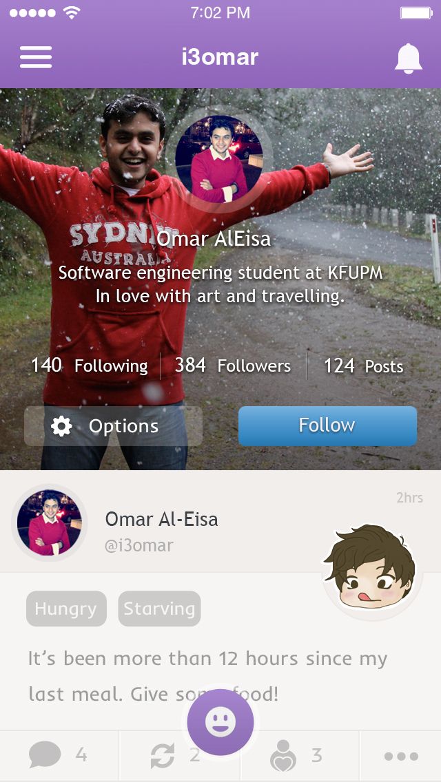
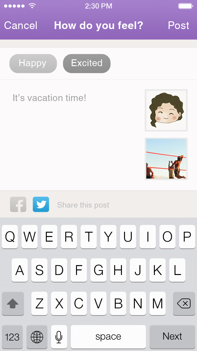
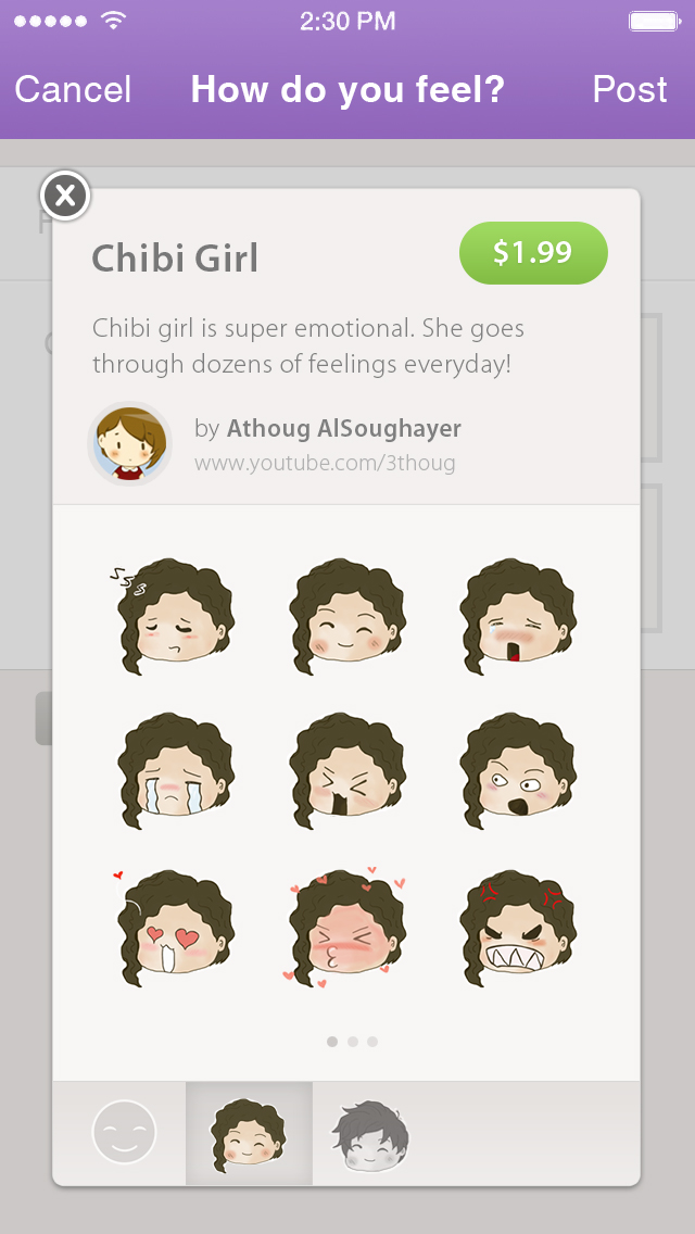
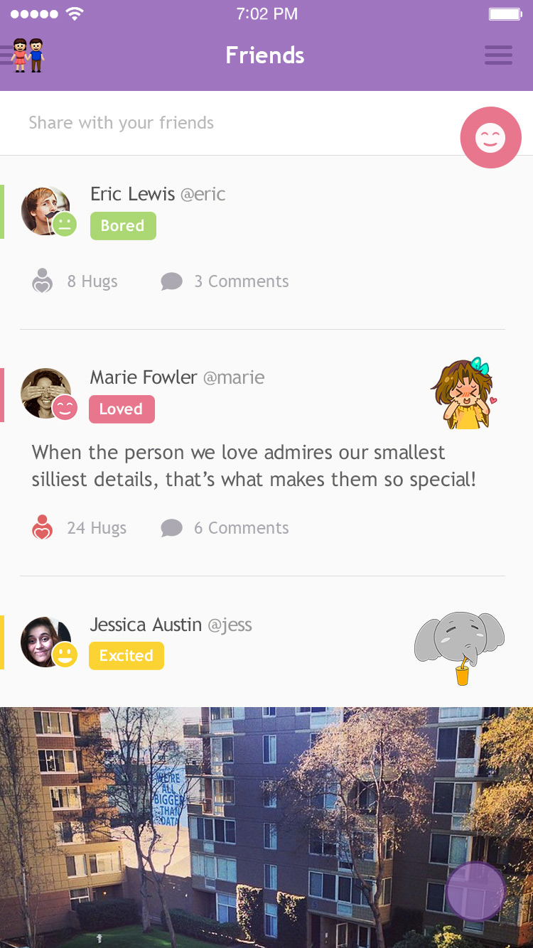
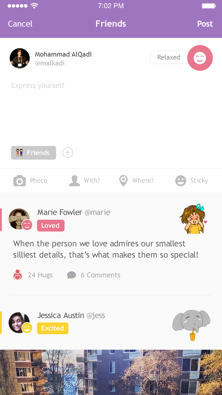
Based on the observations mentioned above, we decided to completely redesign the app to be centered around expressing feelings and connecting over emotions. The ‘home’ screen of Feelit v2 was the social timeline where users could see their friends posts and create a post of their own. We also expanded on these posts to include more than feelings; users had the option to add captions, photos, and stickers.
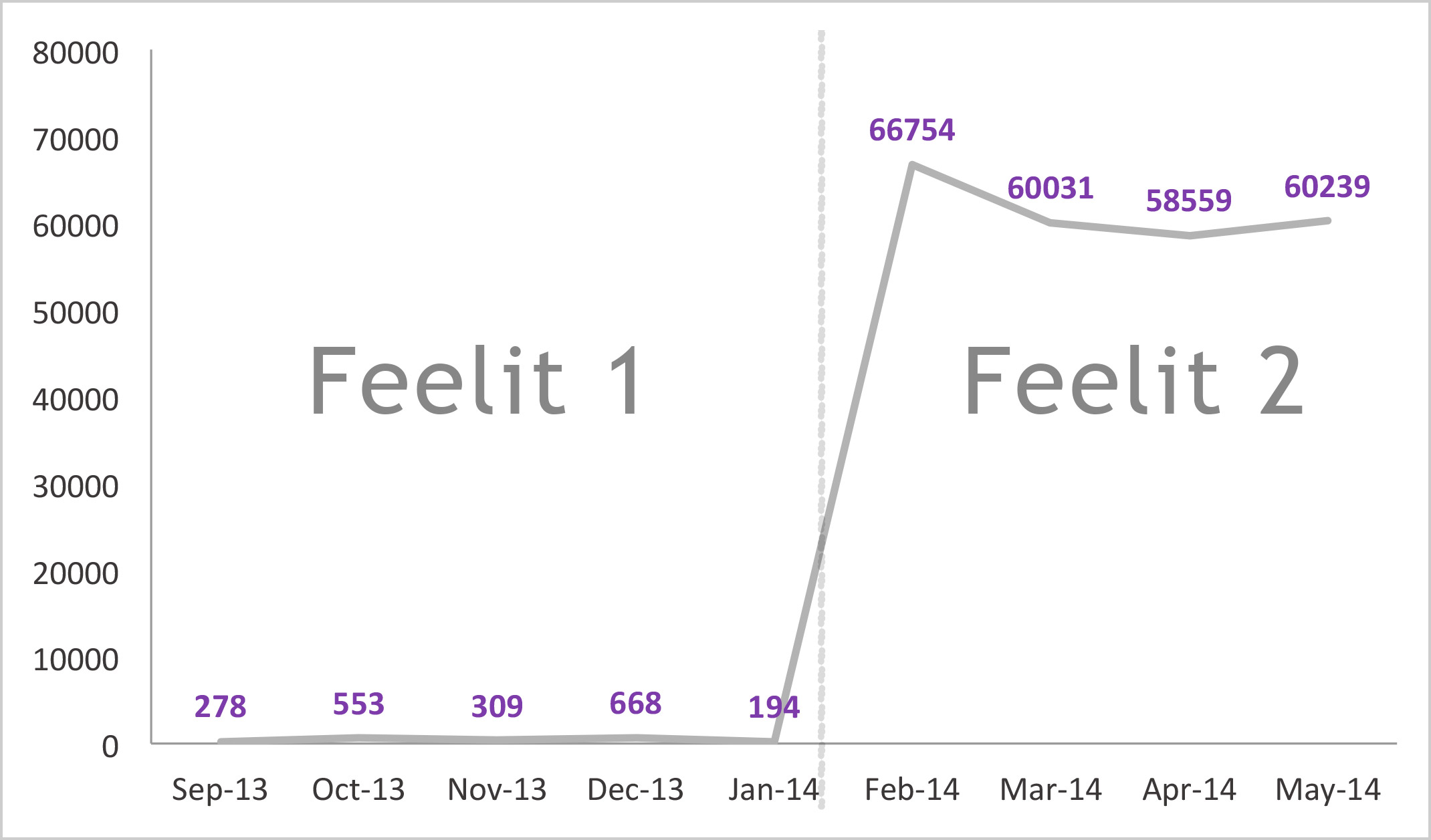
300X Activity Growth
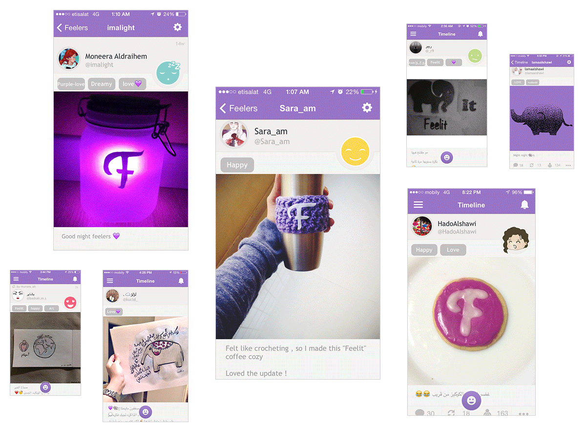
Right after launching the new version, the number of posts per day grew from an average of a few hundreds, to more than 60,000 posts. The community’s love for Feelit and its brand was thriving with people making Feelit-inspired art & the gratitude messages were pouring all over our inbox. It was clear that this was a successful pivot.
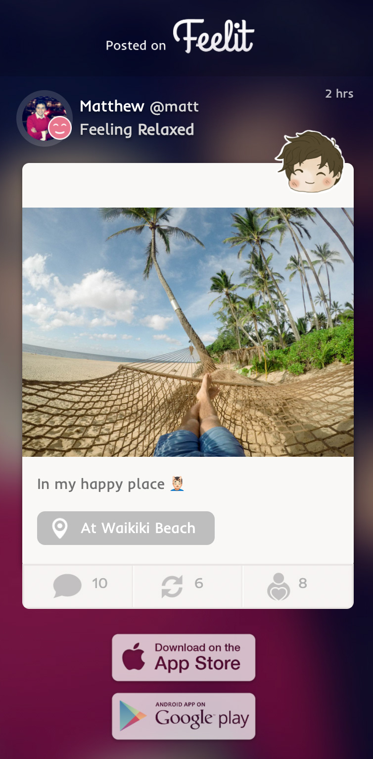
Web View of Posts
Users had the option to share their posts on other social networks. Their post would be published as a URL, and can be viewed in any browser. I designed and developed the front-end part of this page. Click the button to view the page in action:
View Page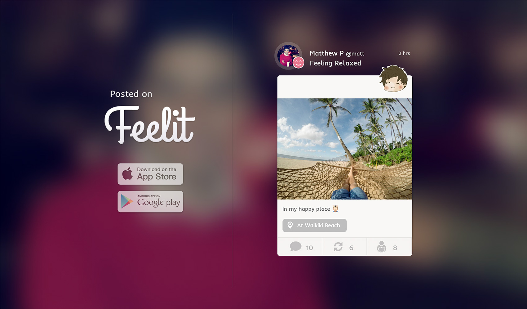
Feelit v3
As Feelit started growing, we decided to expand it as small intimate communities instead of one big group, so we introduced 'Feels' which are feeds that gather people around similar contexts. Version 3 also came with a complete new design focused on simplicity and reflected the beauty of its intimate environment.
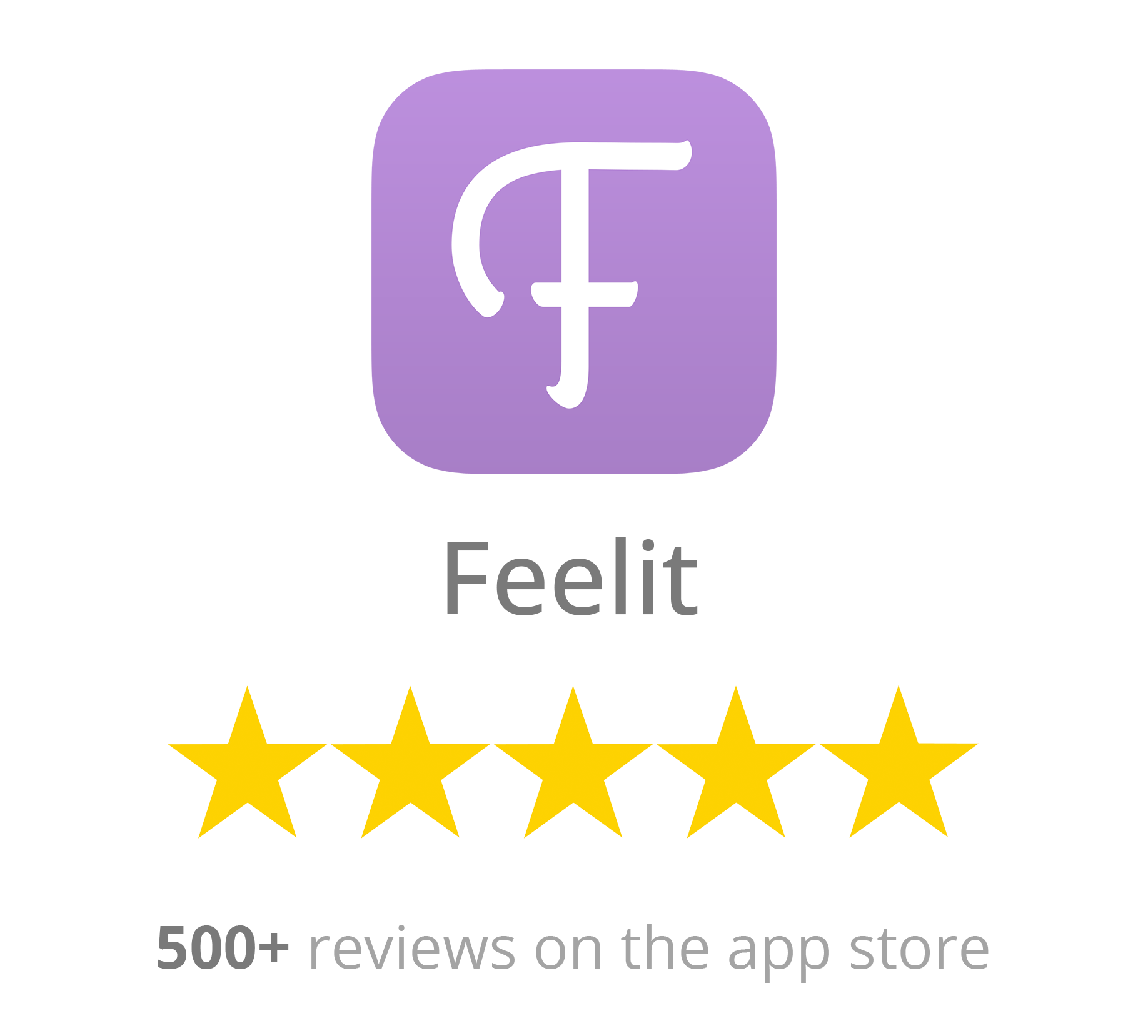
User Reviews
During its lifetime, Feelit maintained a 5-star rating on the app store (over 500 reviews!).
📰 In the Press
Feelit managed to gain some spotlight. Here is some of the coverage in the press:
How 4 Saudi Entrepreneurs Created an App that Tunes to Your Emotions; It's Feelit
https://www.arabnet.me/english/editorials/technology/apps/how-4-saudi-entrepreneurs-created-an-app-that-tunes-to-your-emotions-its-feelitFeelit Secures $100K from BootstrapLabs
https://www.arabnet.me/english/editorials/entrepreneurship/startups/feelit-secures--100k-from-bootstraplabsThis “Feelings” App from Saudi Arabia is Heading to Web Summit 2014
http://www.barakabits.com/2014/10/feelings-app-saudi-arabia-heading-web-summit-2014On the strength of new investment, Saudi emotion sharing app leaves for Silicon Valley
https://www.wamda.com/2014/10/saudi-app-for-sharing-emotions-receives-investment-and-leaves-to-silicon-valleyFacebook with feelings - new social network is sharing the love
https://www.independent.ie/videos/facebook-with-feelings-new-social-network-is-sharing-the-love-30721757.htmlTwo Arab Startups Reminding Us That Sharing Really Is Caring
https://www.elanthemag.com/two-arab-startups-reminding-us-sharing-really-caring/