My Role
Senior product designer, growth
Team
Senior product manager
4x senior-staff engineers
Engineering manager
In 2023, I joined Nextdoor, a public company in the consumer social space with over 40 million weekly active users. During my time there, I worked with multiple teams on various high-impact growth initiatives, driving metric all across the funnel. From new user acquisition, to retention (WAU), and all the way down to referrals in the form of digital invites. In this case study, I'll share a bit about how my team and I focused on value first to drive growth by designing and building a feature called the Contact Map.
Postcard invites → Digital invites
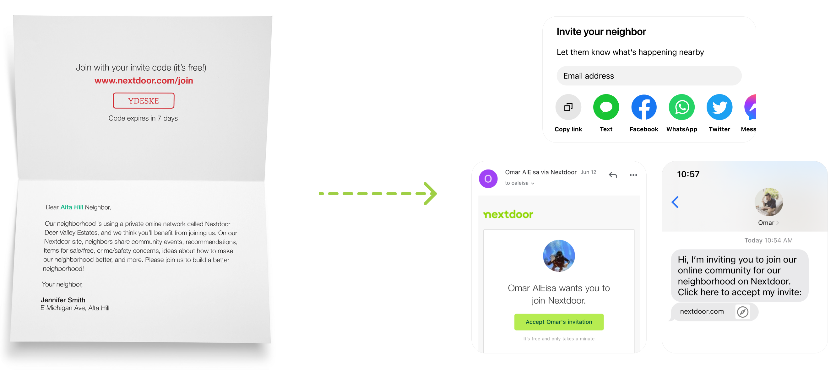
Historically, Nextdoor relied on postcard invites sent by mail as one of the main growth levers. It worked really well. However, it was costly. A little before I joined Nextdoor, the company decided to pull investment from postcards into other initiatives like digital invites.
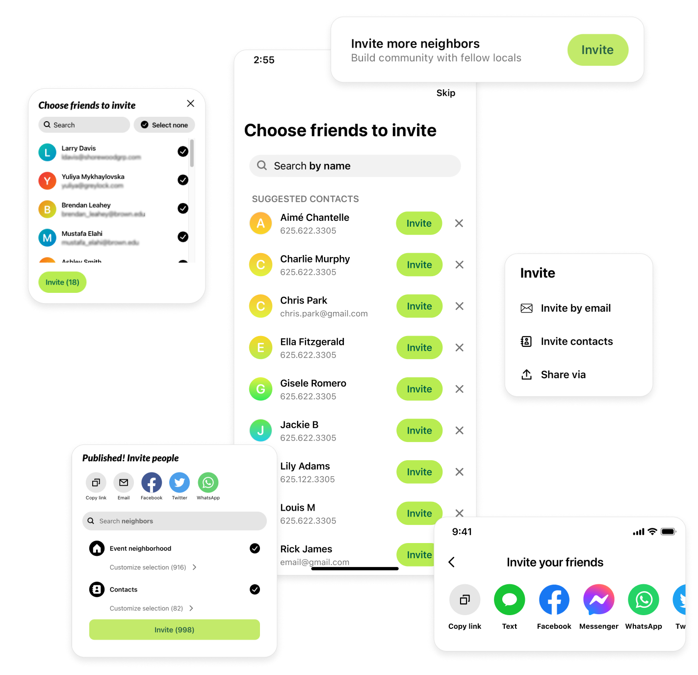
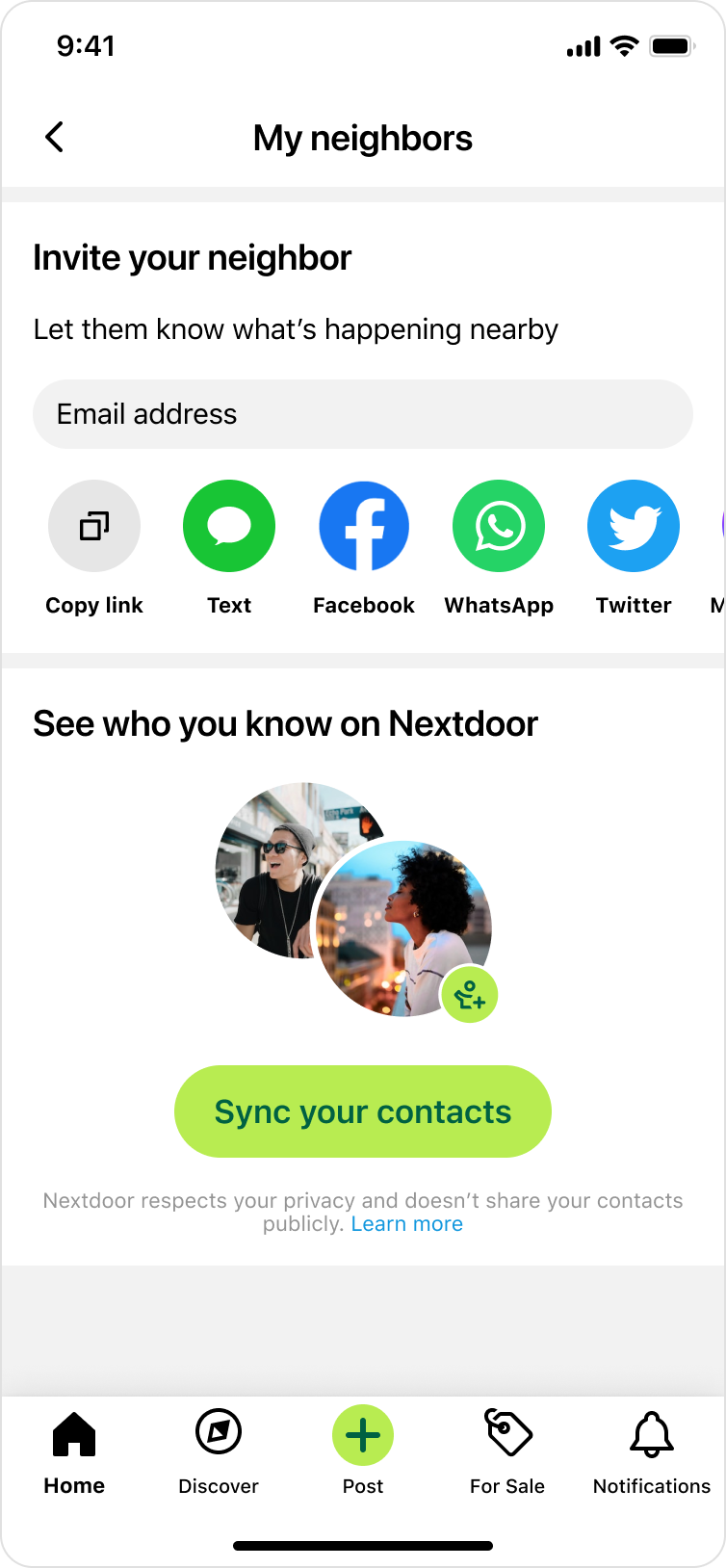
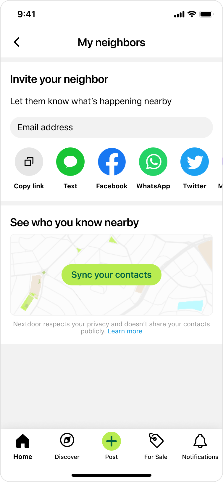
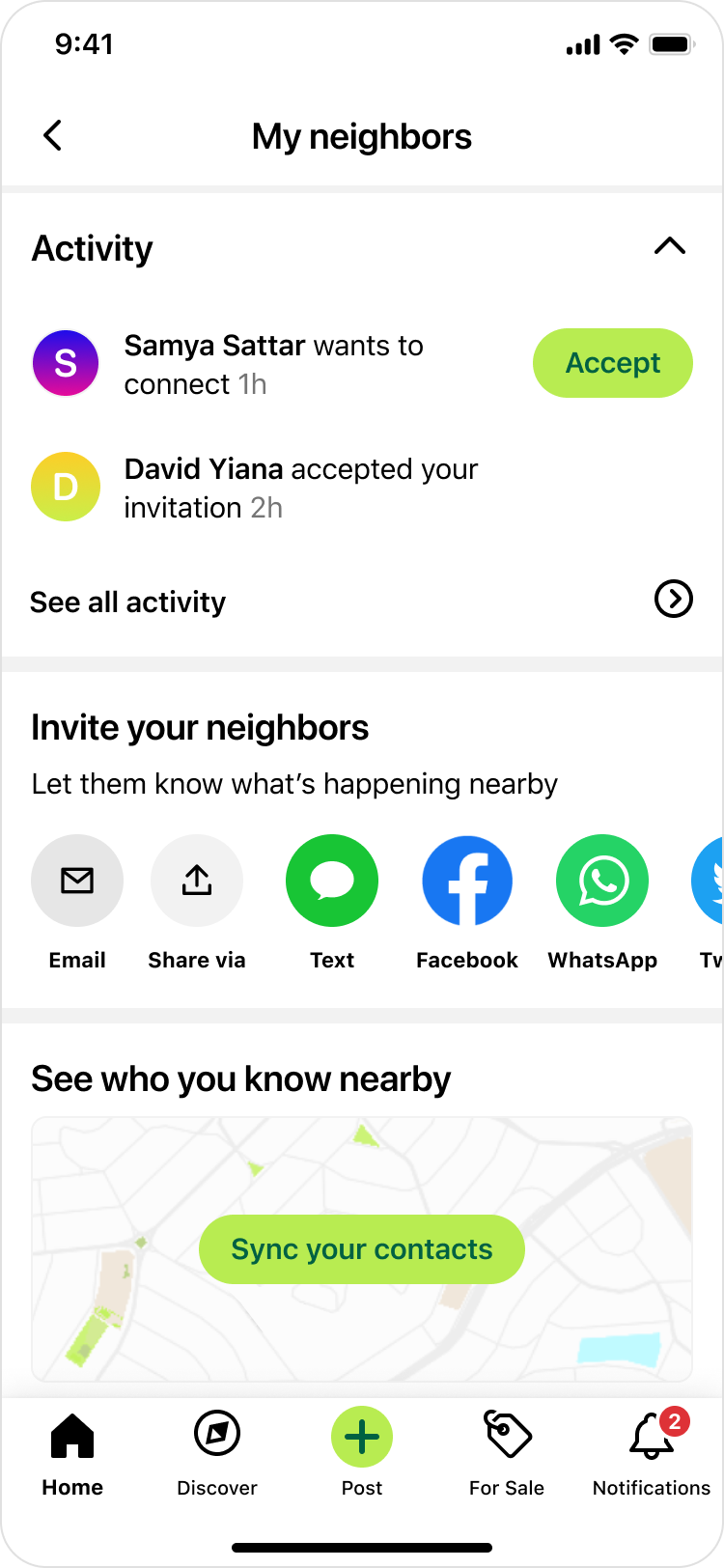
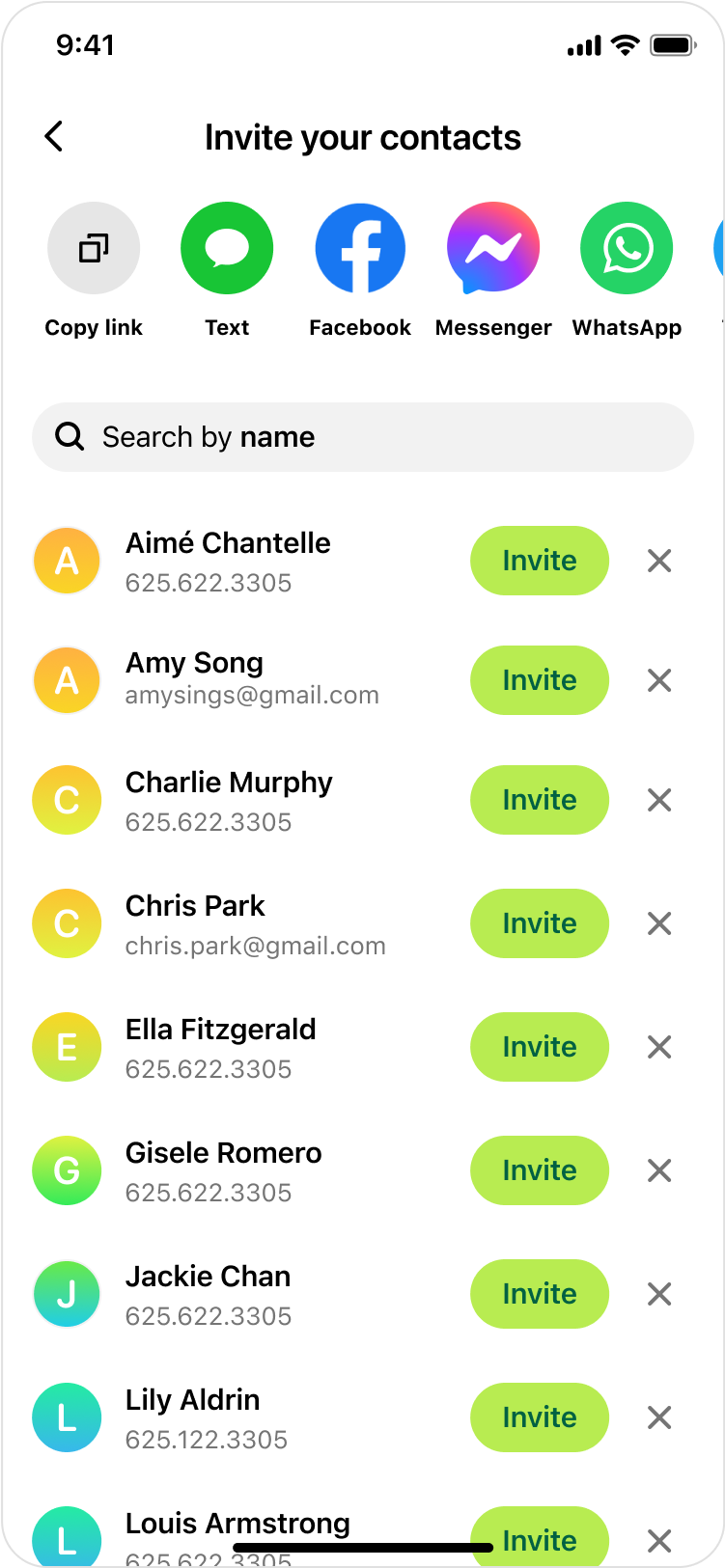
Contact sync was one of the most effective ways to drive digital invites. After people sync their address book, their contacts would be displayed in various touchpoints where it would make sense to invite people (e.g. event creation flow). It's been established that an increase in contact syncs positively correlates to an increase in invites, not to mention the added benefit of building a strong social graph.
👉 The more users sync their contacts, the more user growth through digital invites.
Problem
There was a lot of friction to sync contacts & not enough users were doing it. In addition, digital invites weren't working super well, and there was a lot that could be improved. Upon joining this team, I conducted a comprehensive audit on digital invites. One thing was super clear: we are overwhelming our users with invite prompts everywhere. There were even instances where a user is shown a modal asking them to invite friends without any context or why they should do that.
🔍 Our research team also shared some useful insights from our users, highlighting how we're not focused on the value - why would the user want to invite their friends? What value would that bring to them? Here is a user quote:
👤💬
“It’s obviously of great benefit to Nextdoor to have my contact list. But you’re struggling to make it sound like it’s of benefit to me” - Nextdoor user
In addition, many users indicated that they are not gaining enough value from their Nextdoor experience. “I haven’t found it worthy of inviting anybody”, one user said. It was clear that we needed to invest more in the value we provide our users.
Task
Our team was tasked to create a new experience that is aimed to increase contact syncs and invites sent.
🎯 Success Metrics:
- Contact syncs
- Invites sent
The details were left for us to figure out. So, with this empty canvas, my product manager and I got to work and started early discussions by asking the following questions:
- How might we increase contacts syncs & digital invites by focusing on the value we bring to our users?
- In what ways can we imagine Nextdoor being a better experience with more people I know?
- How can we leverage Nextdoor's focus on people and places?
User needs
With input from our research team, we identified the following relevant user needs:
- “I want to feel more connected to people in my neighborhood that I know in real life or have engaged with on Nextdoor.”
- “I moved to a new city / neighborhood and want to see if any of my old friends / acquaintances live nearby.”
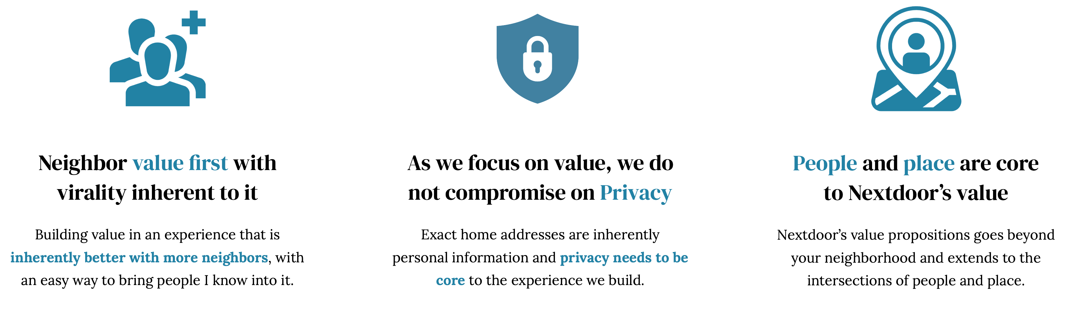
Principles
In order to guide our thinking and to help us evaluate ideas, we came up with the following product principles:
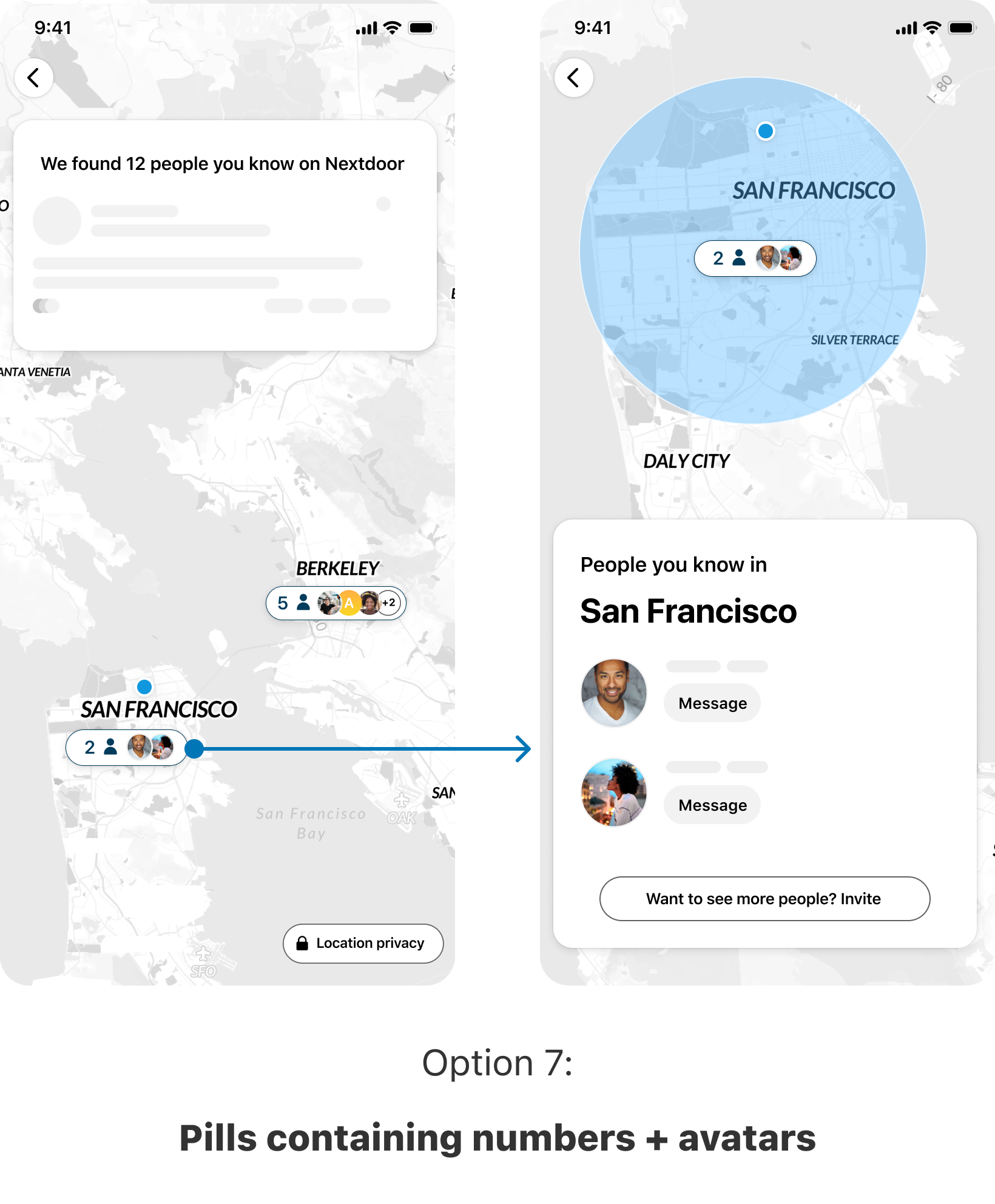
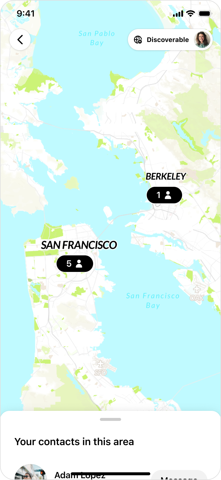
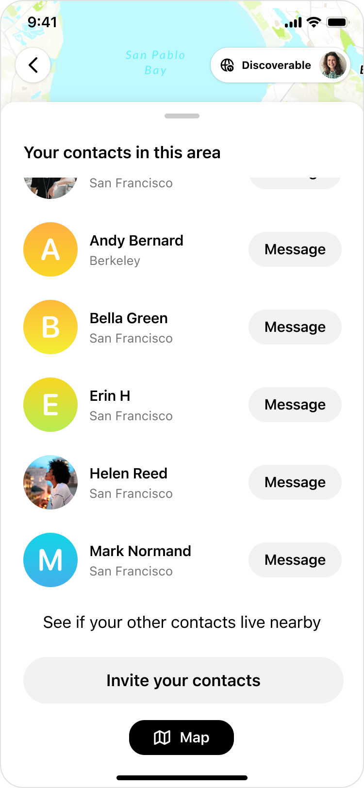
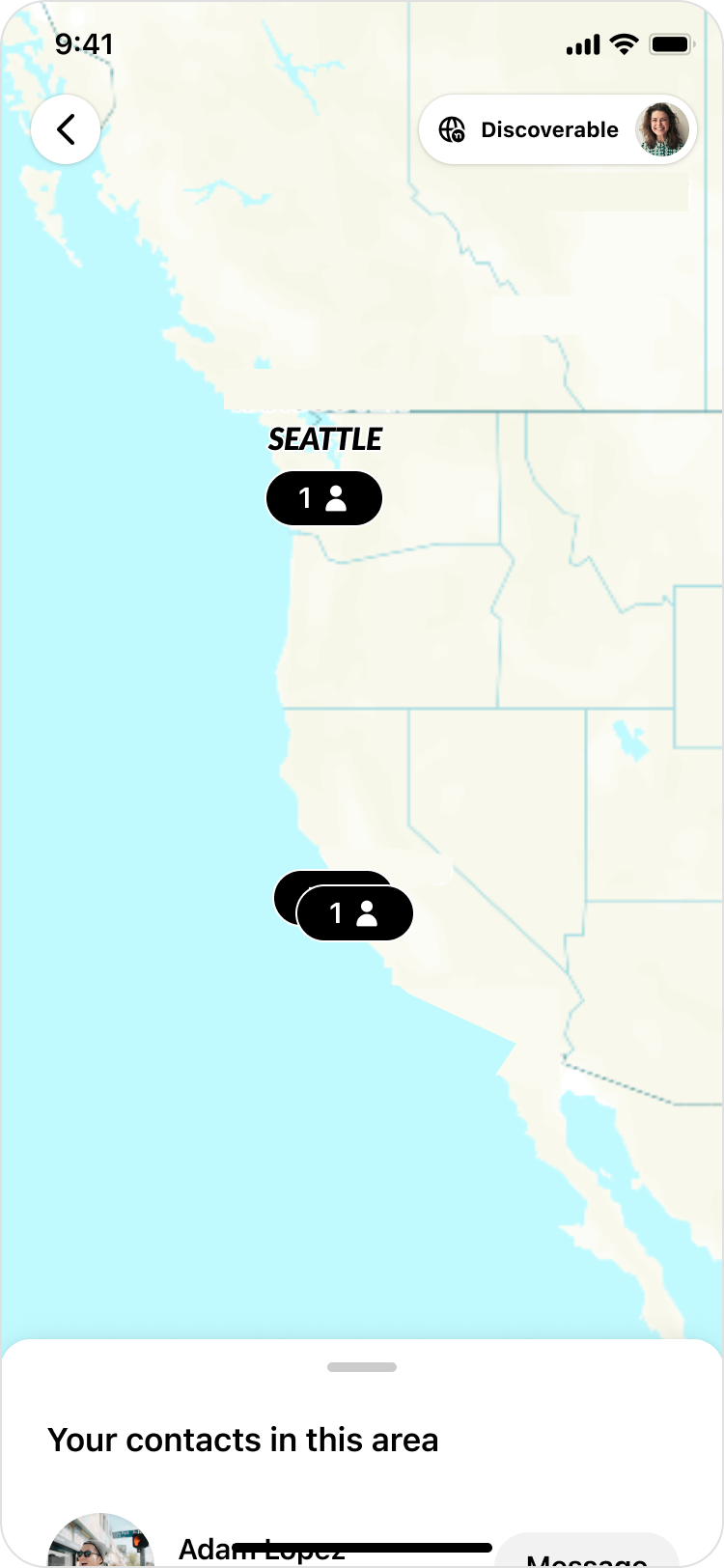
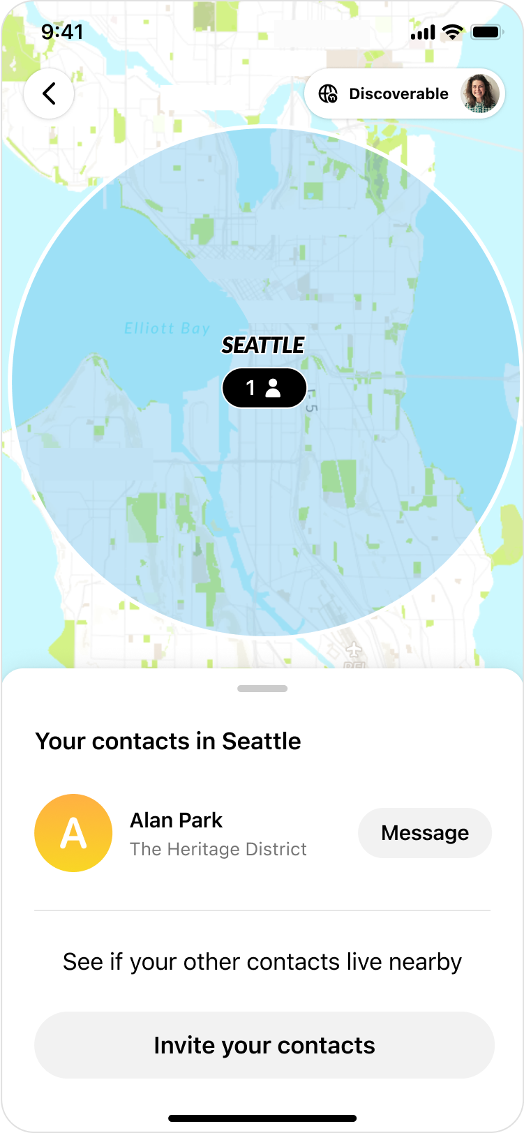
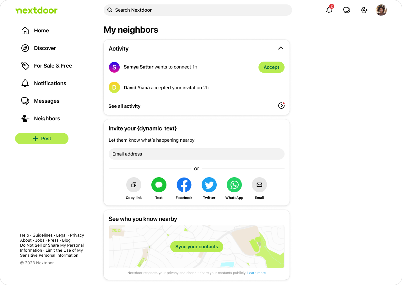
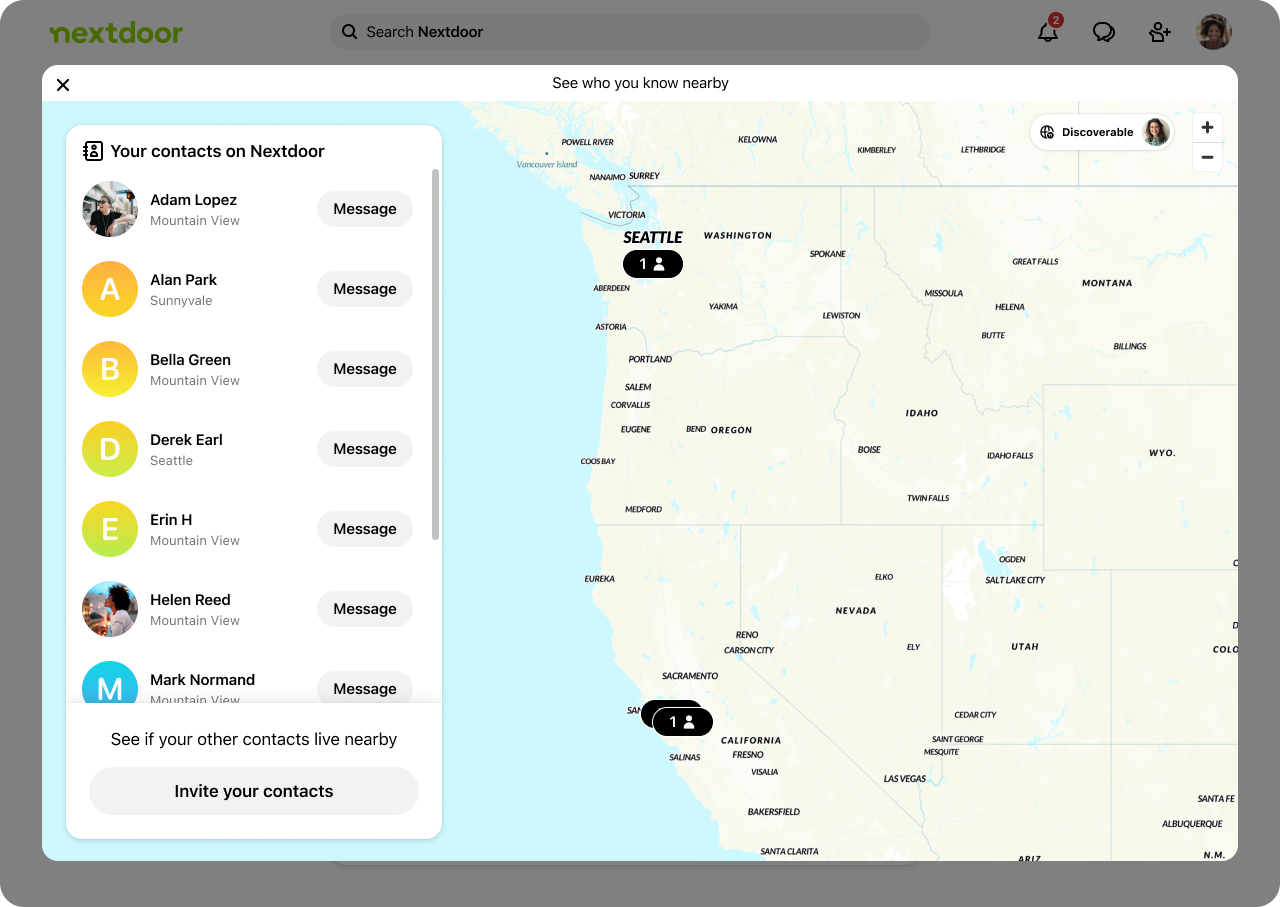
Selected concept: Contact map 🗺️
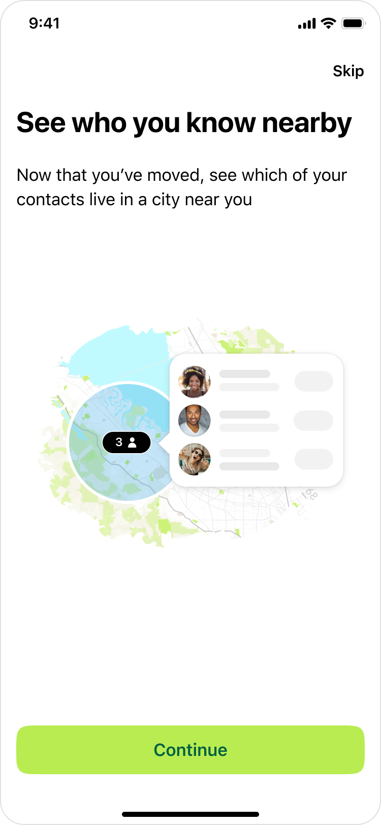
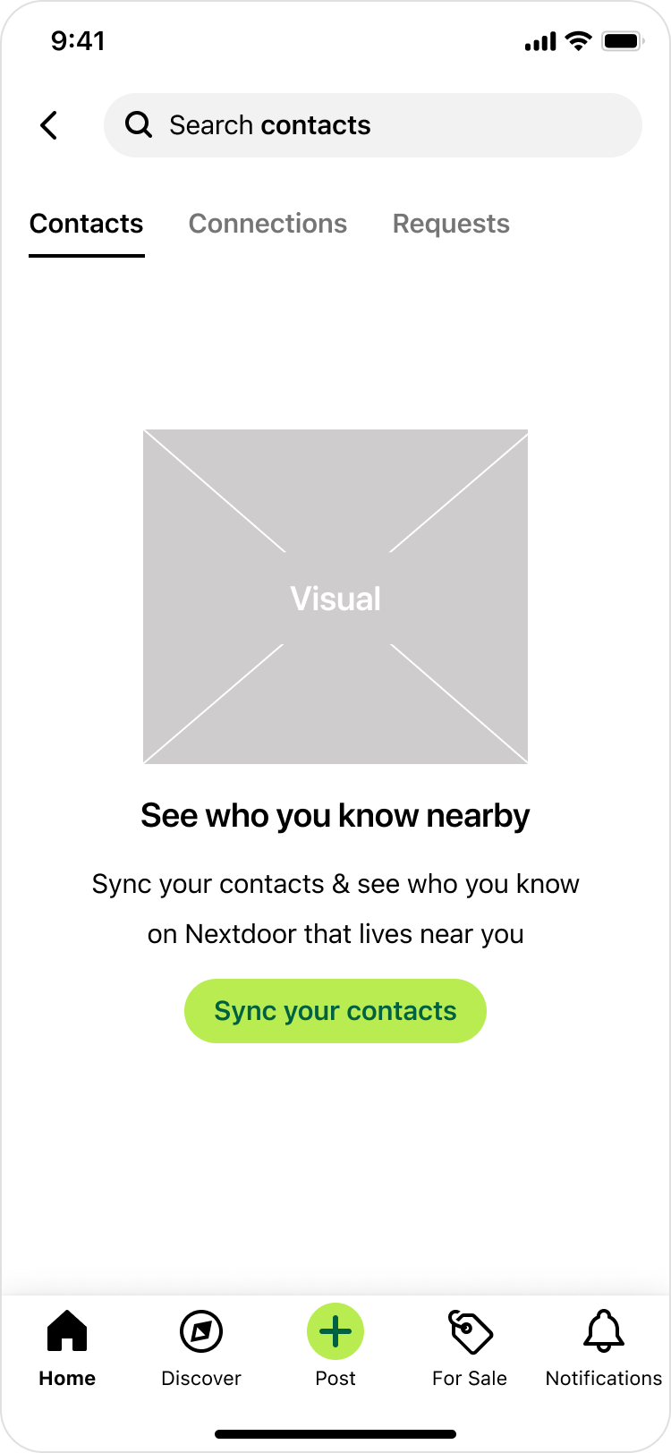
After brainstorming and exploring different ideas, we landed on a concept that we called the 'Contact Map'. The idea is for users to sync their address book to see a map of their contacts & where they currently live.
But before diving deeper, we wanted to validate the need for this concept. So, we A/B tested the contact sync prompt. The option on the left (control) is what we had before. The option on the right (treatment) is the new concept. It has a map visual and a different messaging.
After getting statistically significant data, we saw that users were 10% more likely to sync their contacts in the treatment vs. control. Clearly, this need resonates with our users. They have more motivation to sync their contacts because they see a stronger value they would get; see who you know nearby.
User journey / early sketches
My product manager and I collaborated on writing a user journey about a hypothetical user named Susan & how she interacts with this feature. I also designed early sketches to go along the story. We had multiple goals behind this exercise:
- Explore potential use cases & start to define the scope.
- Bring the user front & center, and think more from the user's perspective.
- Get early feedback from different stakeholders. This was a high-priority initiative that included regular design reviews with the Chief Product Officer, Head of Design, Directors of Product and Engineering, legal, and other stakeholders. For this diverse set of stakeholders, it was important to get the right feedback at the right time.
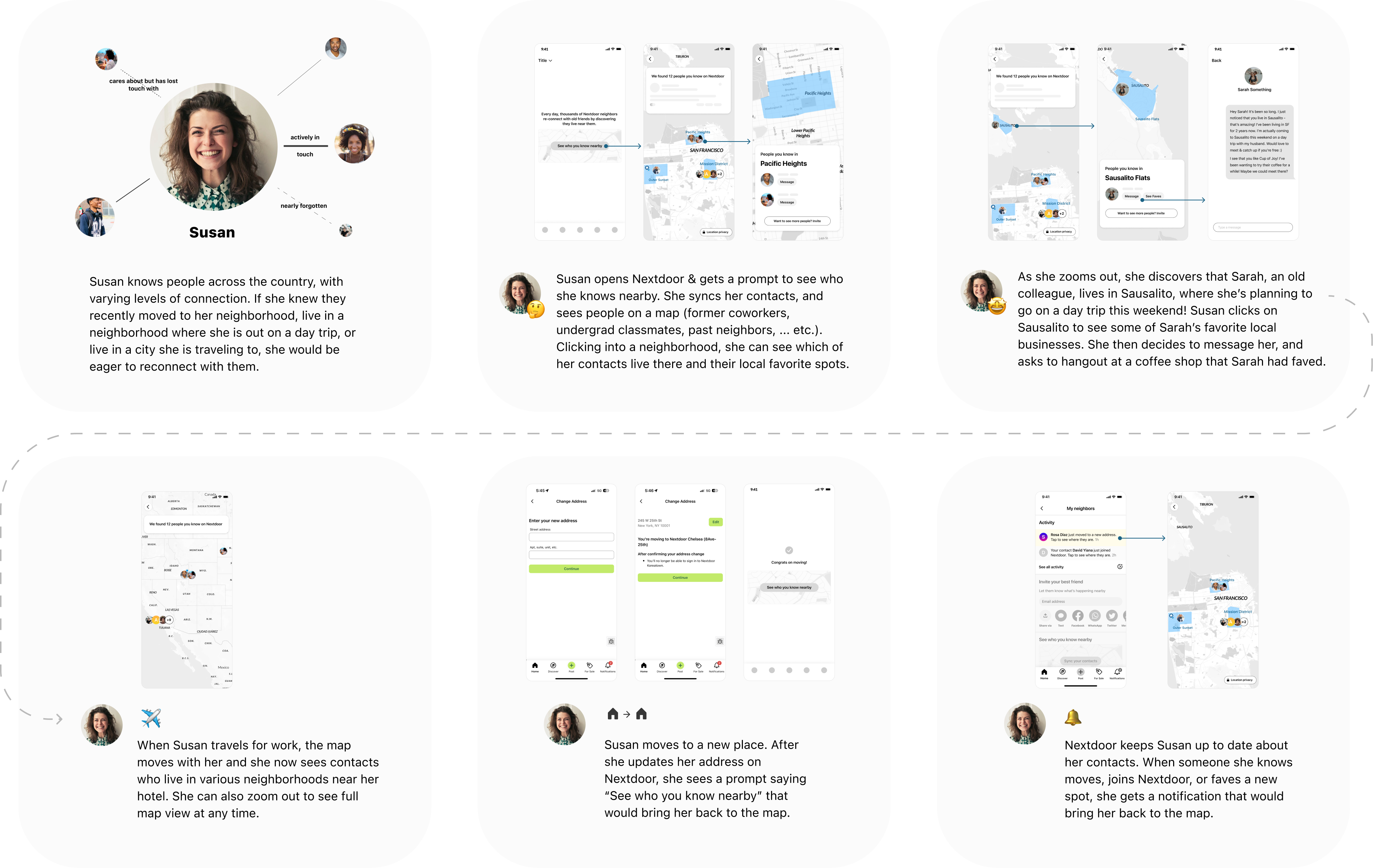
We received great feedback from the team. Having this journey laid out also brought up questions like:
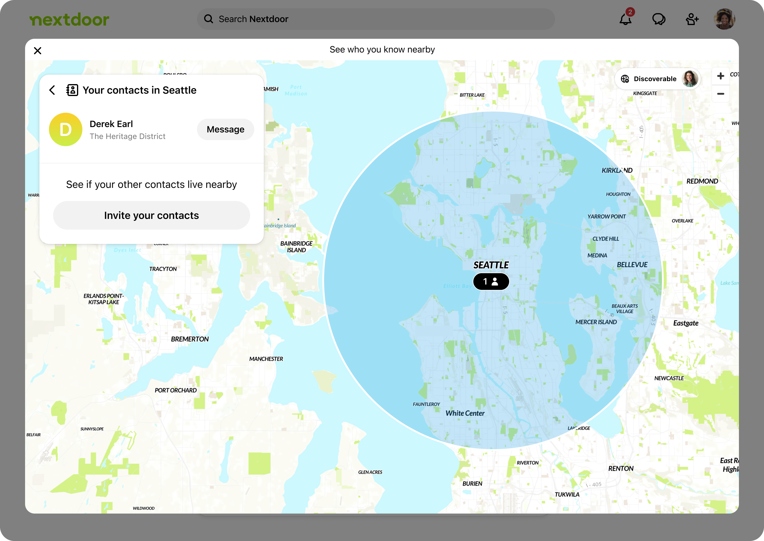
- How might we show & group people on the map? How can we do it in a way that is useful but also protects our users' privacy?
- After the user finds a contact on the map, what’s the “next best action” they can take?
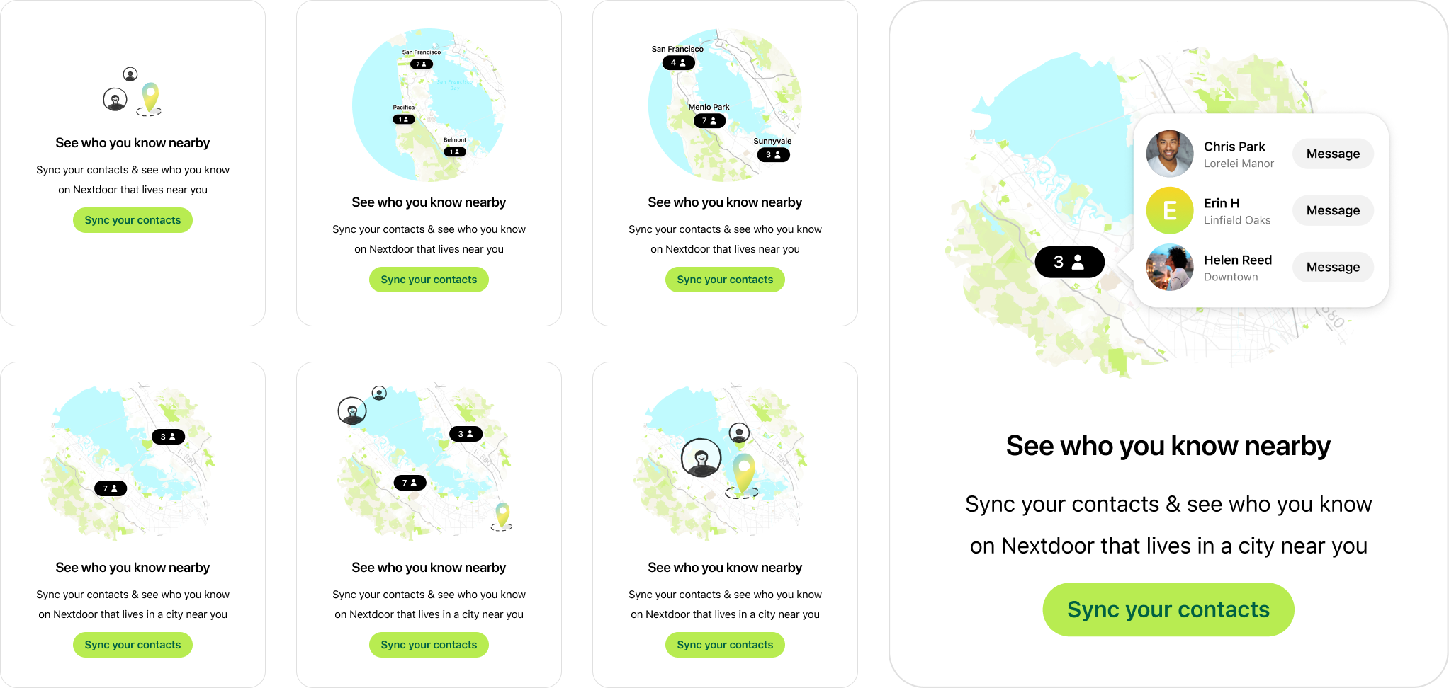
I then started to explore a few options.
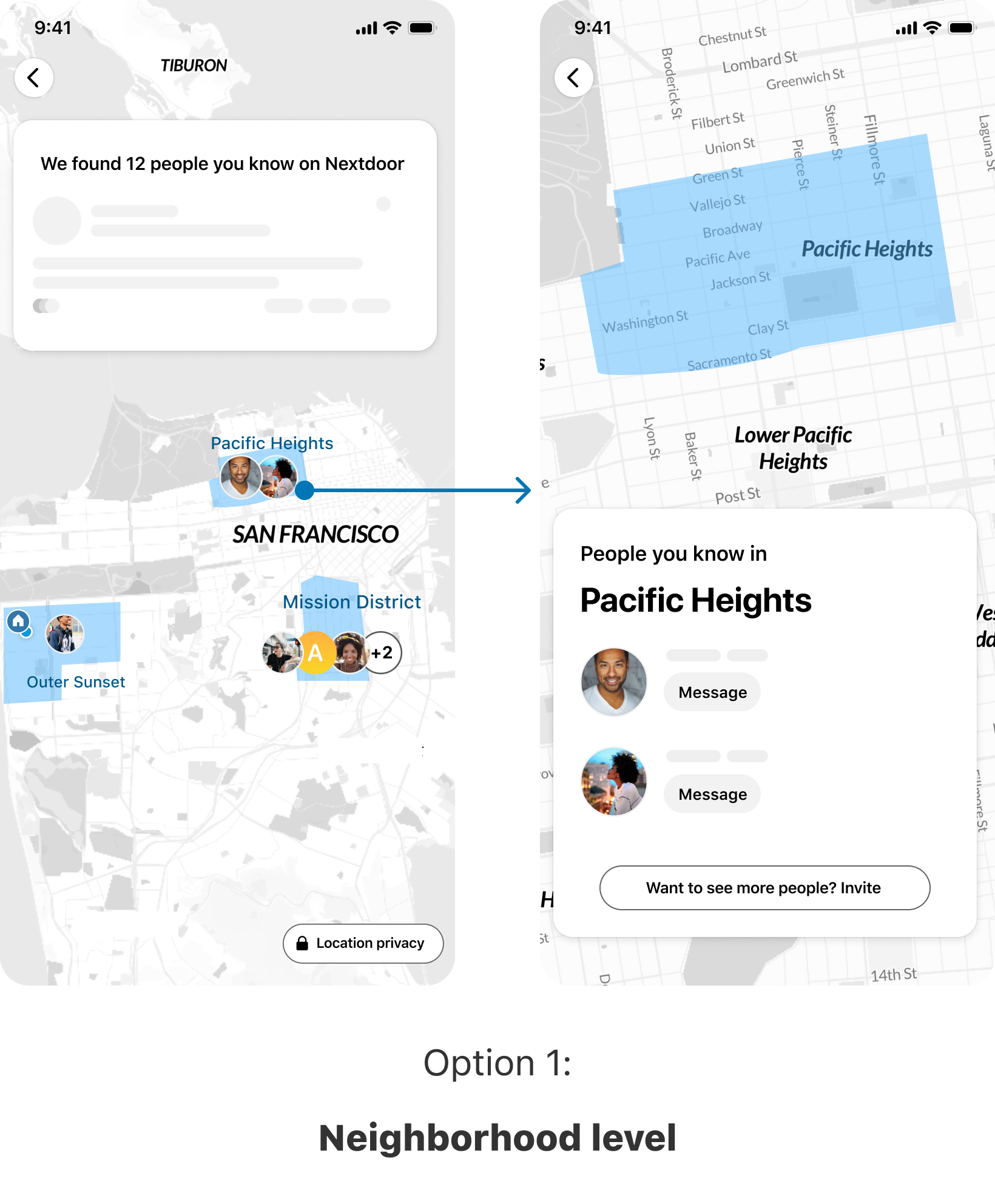
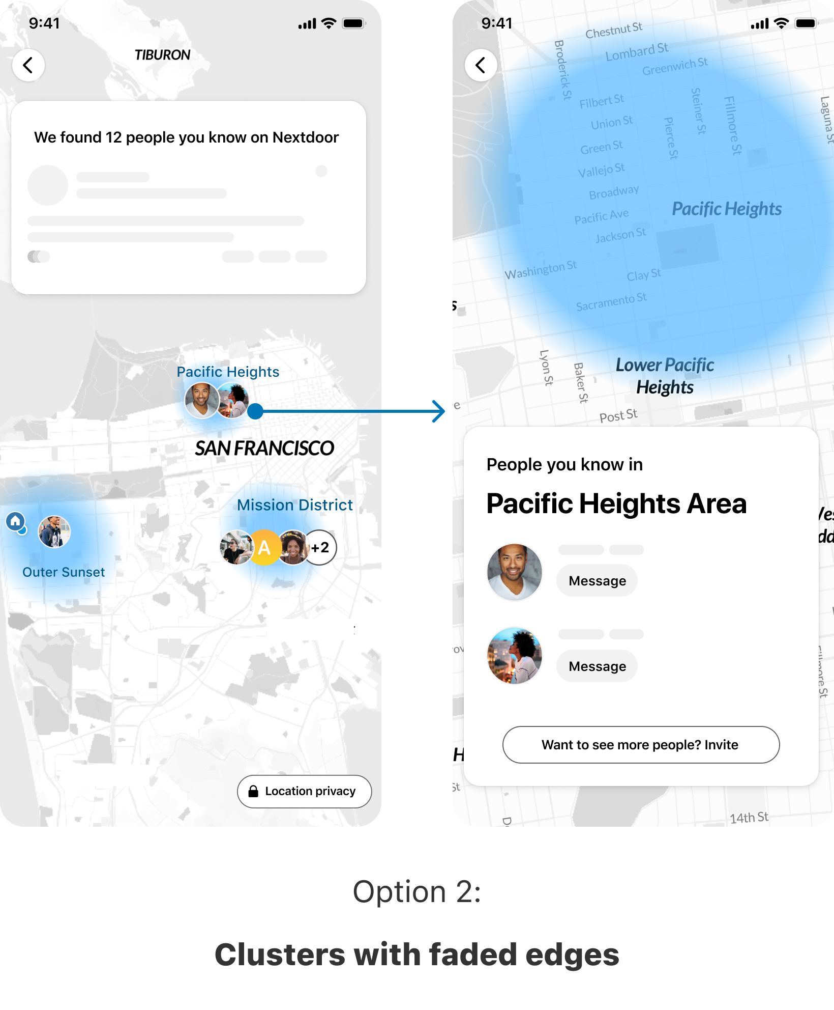
After doing these explorations, I started to narrow down what decisions we want to make and what are the options for each one.
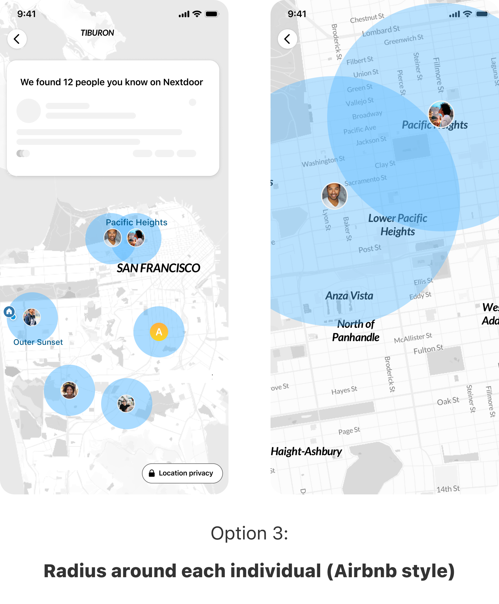
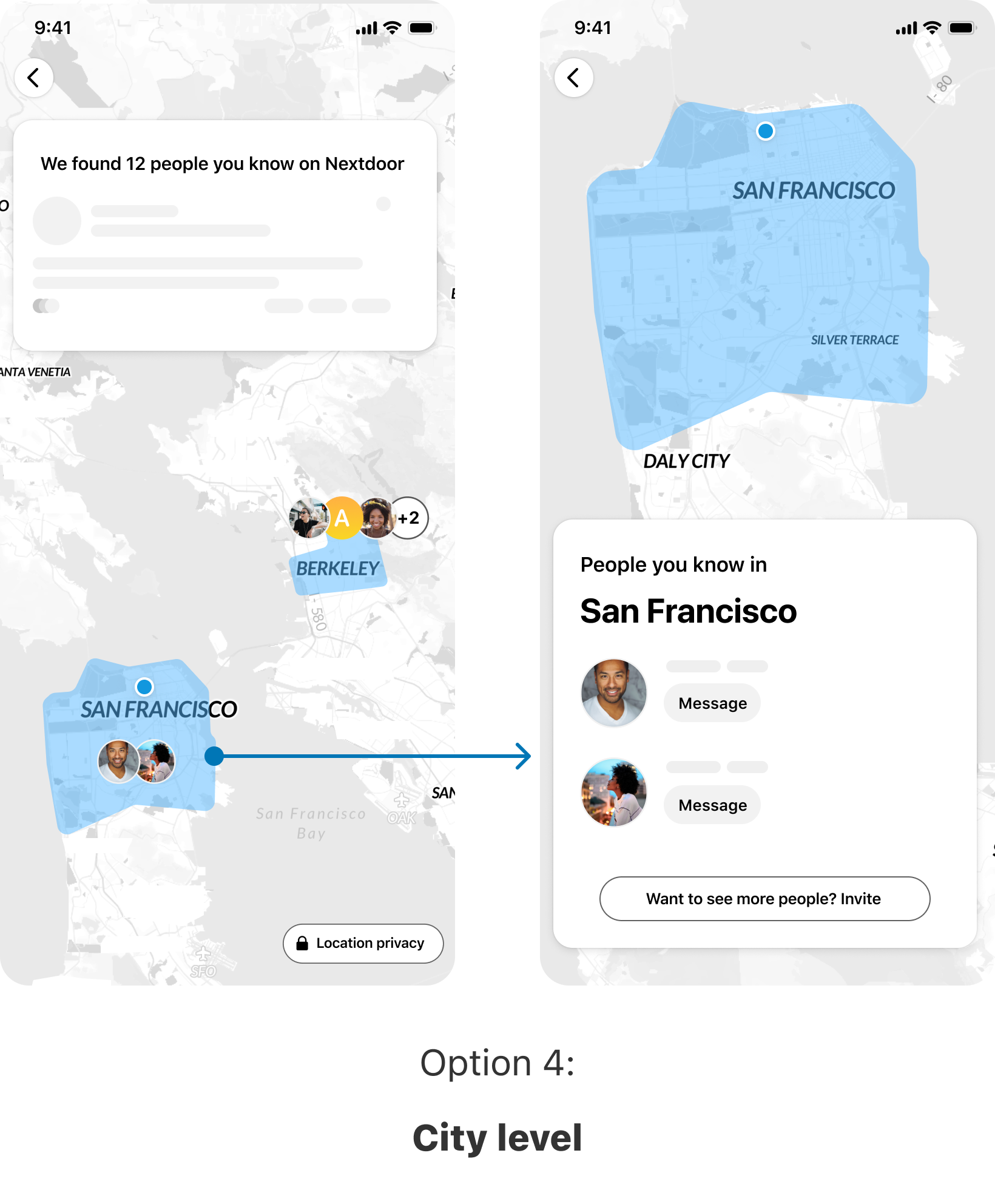
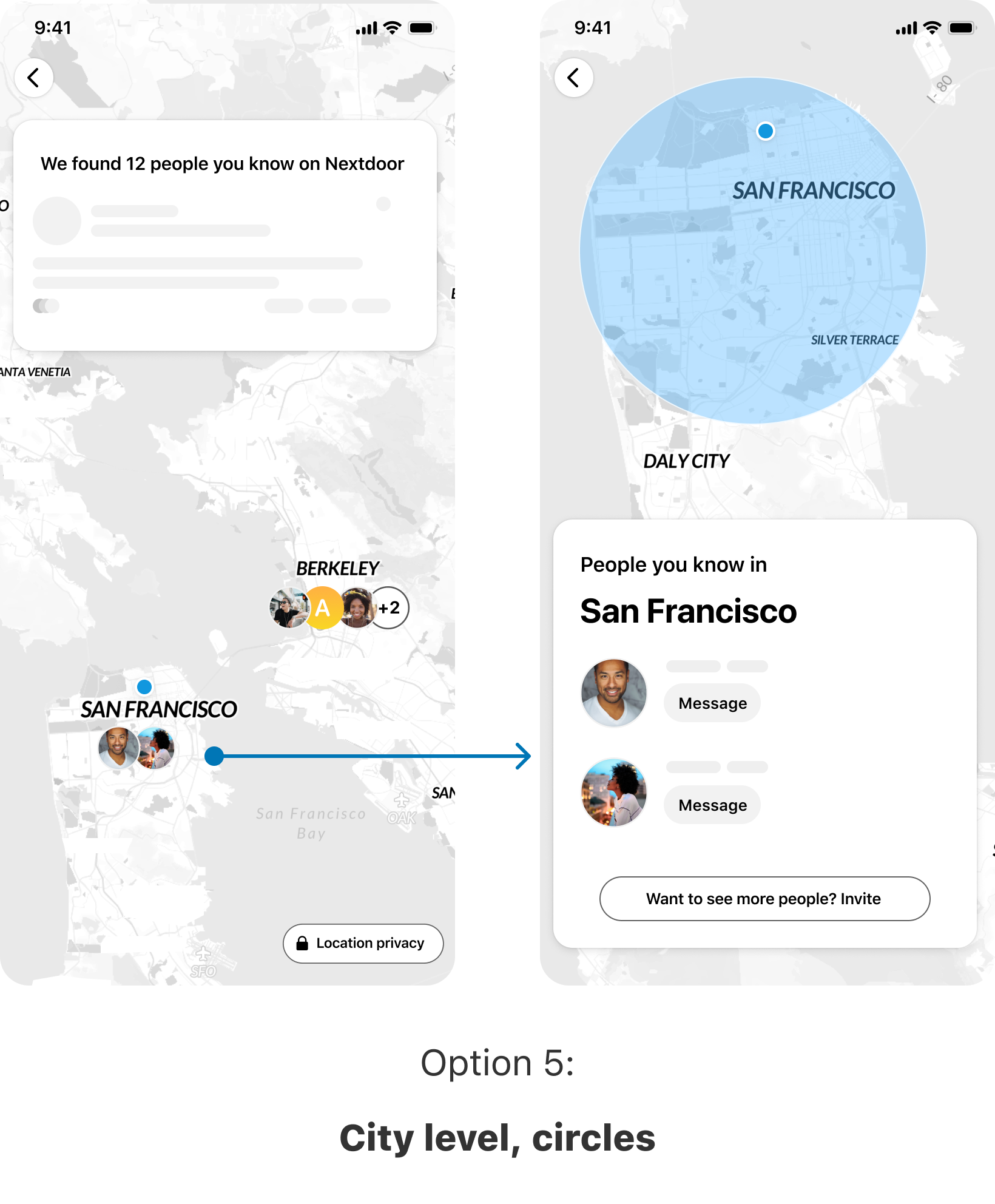
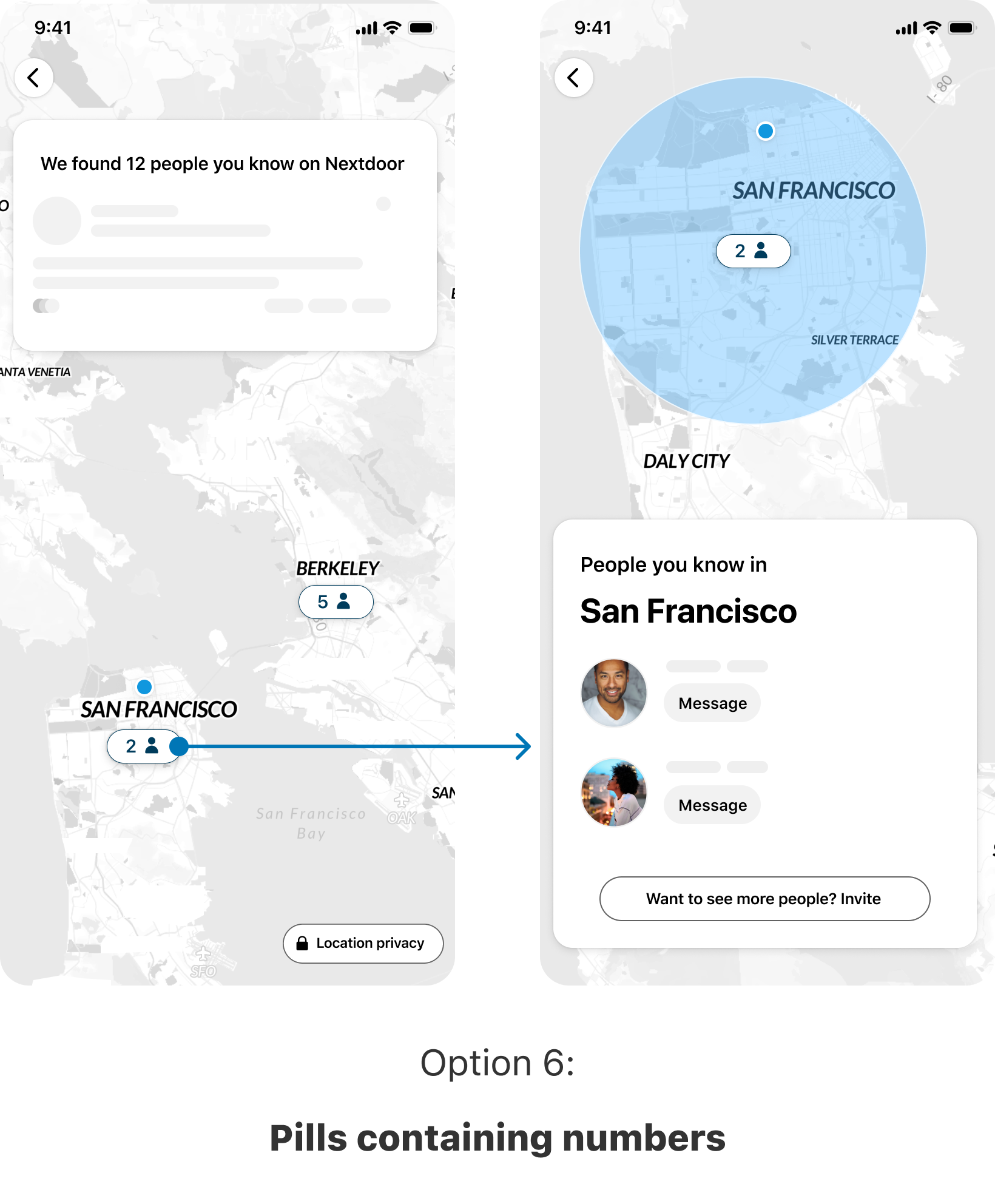
Clustering Level:
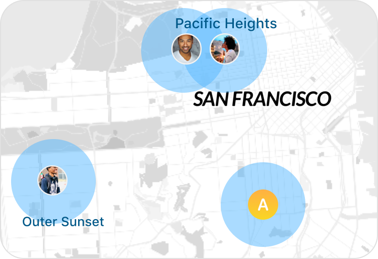
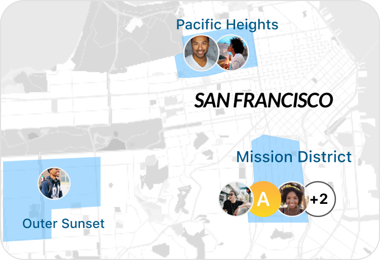
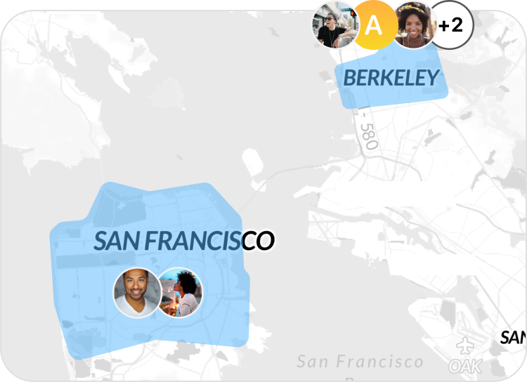
Location boundary:
Visual indicator:
As the experience started to take shape, the success metrics for this project were finalized:
🎯 Finalized Success Metrics:
- True North: Invites sent
- Sign post: Contact syncs
- Sign Post: VNs from digital invites
- Guardrail: Discoverability opt-out (i.e. opting out of the feature by turning off location & not seeing other people's location)
- Guardrail: Customer support cases with negative sentiment
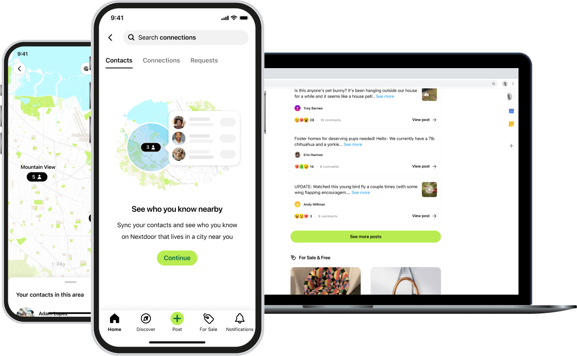
Final design
Some snapshots of the web (desktop) experience:
Results
The results were extremely positive. We saw an increase in all the success metrics: contact syncs, digital invites sent, and user growth from digital invites. In addition, there was strong qualitative positive feedback internally and externally; users loved it, and I was often told by some of my co-workers at Nextdoor that this is their favorite feature! It was even called out in the company shareholder letter of Q3 2023.
Increase ⤴
In contact syncs / digital invites sent / new user growth from digital invites.
Hundreds of thousands
Monthly traffic to this new surface.
Strong positive feedback
Externally and internally
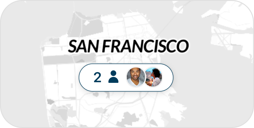
Designing visual promos
Following the successful launch of the contact map, we worked on promoting it at additional entry points throughout the app. For these entry points, we needed a visual & some copy to describe this feature. This was my time to flex my visual design muscle 💪.
Task
Create a visual asset to be used in Contact Map entry points.
I went ahead and designed a few options. And with every new option I created, I felt that the visual was evolving. Until ultimately, I created one that utilizes some of the same UI elements used in the feature. This felt elegant. My product manager & I both loved it. It conveyed the idea & gave a glimpse of what the feature looks like. We shared this with engineering team to get their feedback.
Our engineers loved it too. However, one of them highlighted the additional challenges posed by having labels here (i.e. people names, the message button).
Implementing these correctly requires localization support for different languages. Also, hearing him say that made me realize & think about the associated design and implementation complexities that we needed to tackle to ensure that the design looks good in all supported languages - since some languages might occupy more horizontal space than others. All of this would add a lot of scope. So, was there another option?
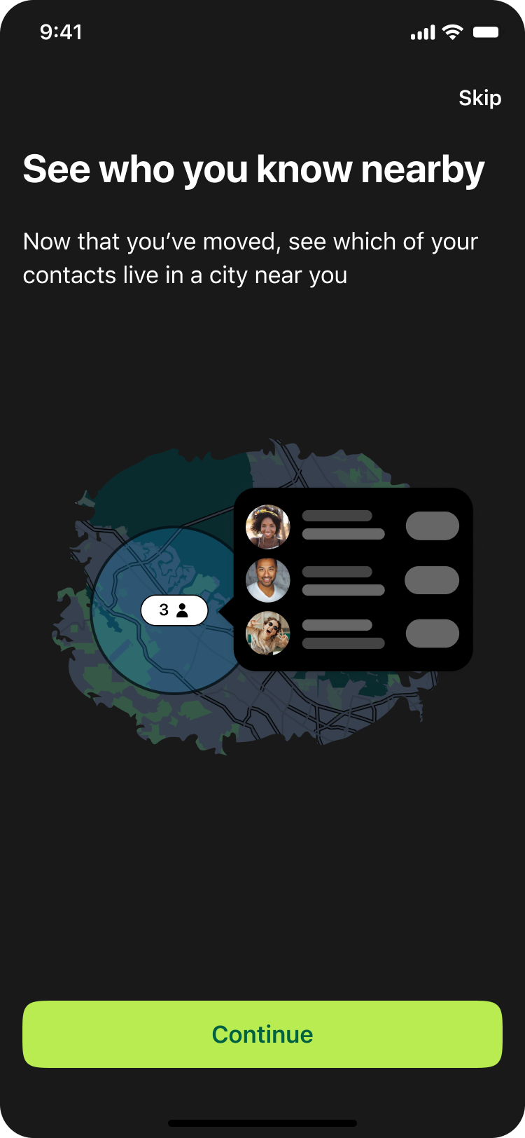
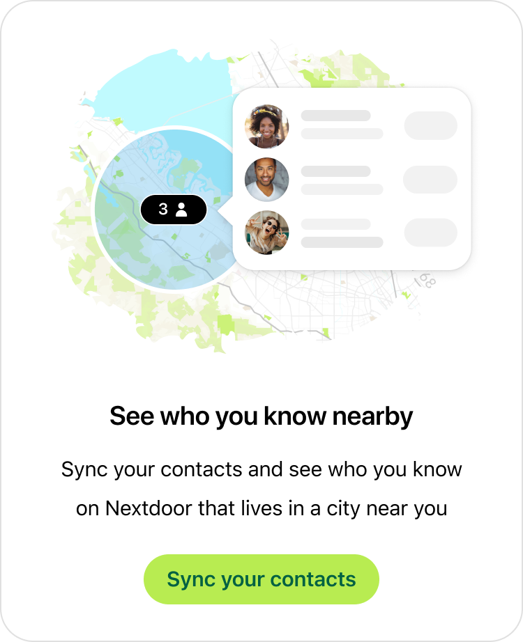
I then iterated on this design and replaced the text with a skeleton placeholder (see below). This new solution not only scales across languages, but also accommodates for future changes. For instance, the 'Message' CTA could be replaced with another action seamlessly without needing to update this visual. Another addition you might notice here is the blue circle. Adding this not only made it visually more appealing, but further emphasized the privacy behind this feature:
Here's how this final design looked in light & dark modes: